The IBM Selectric Composer produced typed output which was very similar in quality to typesetting.
It did fall short in a few ways, however, and it may be possible to remedy some of them.
One is that the unit system was the same for every typeface.
Differences in design between typefaces mean that not every typeface would normally have the same spacing. One common, but subtle, difference is that in some typefaces but not others, the letters E and F are noticeably narrower than most other upper-case letters. Another, already noted on the first page of this section, is that the x-height, which is the relative height of small letters without ascenders or decenders, such as a, c, e, o, and x, differs between typefaces, and that affects how wide capital letters should be compared with small letters, and this can be quite noticeable in some cases. Another striking difference is that in some typefaces, like Caslon and Baskerville, the italics are much narrower than the Roman, whereas in other styles the Roman and italic are either very similar or even identical in width.
On modern electronic typewriters, this is easy enough to deal with. Print a font code on the cap of the element, and have the typist enter it somehow. But since this will be used frequently, perhaps adding a control dial, instead of having it entered with the CODE key on the keyboard, is a good idea.
Another limitation of the Selectric Composer is that the widest characters were 9 units in width; if those characters were on the same scale as the other letters in the alphabet, they should be wider.
In the case of Press Roman, the ideal width is exactly 10.5 units, so 10 units is an acceptable rounding, but other typefaces might benefit from having the widest letters like M and W at 11 or even 12 units.
How can we accomodate this?
The widest characters on a proportionally-spaced element for the Electronic Typewriter 50 were 7/60" in width.
This is a chart of the unit widths of the characters for proportionally-spaced typestyles on the Electronic Typewriter 50, and their positions on the element:
Characters having the maximum width were found everywhere on the element, except on the narrowest band of characters at the top, shown in pink on the chart. And in that band, there were 6-unit characters (that, in itself, is of course, not surprising, since 6 units of 1/60" is a tenth of an inch, and all the positions on an element are expected to have room for normal pica typewriter characters).
The widest characters on an element for the Selectric Composer, for which restrictions on character width were relaxed because it wouldn't be used for making carbon copies, were 9/72" in width - or 1/8", or, to facilitate comparison with the Electronic Typewriter Model 50, (7 1/2)/60" in width.
In the case of the Mag Card Executive, which apparently had a 1/72" escapement, my tentative reconstruction of its unit system is currently:
Its widest characters, 9/72" in width, were also only on the central band; characters up to 8/72" in width were on the two adjacent bands, and the top band had characters up to 7/72" in width, so it followed the same basic restrictions as the Composer.
So if we just put the wider characters on a normal Selectric element, they would not fit properly, and they would cause problems.
A simple and obvious solution comes to mind.
It would be nice if a typewriter aiming at handling all the Selectric typestyles could use 96 character elements in addition to 88 character elements.
One particular benefit is that while the Mag Card Executive was an extremely rare machine, several common electronic typewriters using 96 character elements used typestyles of the same names (and general appearance) as it did, and the importance of this is increased by the fact that the 96 character elements were based on the 1/60" escapement indicated by the white color of the circle on those elements, whereas the Mag Card Executive apparently did use a 1/72" escapement.
If one started with a 96 character element, but only put 88 characters on it, one could have an empty column of characters on the element.
That would allow up to four keys to have either one or two extra-wide characters on them, so allowing m, M, and W to be 11 units wide, for example, would be no problem; in fact, allowing up to 4 extra units at the 1/72" escapement should not be a problem.
However, it's not clear that there is an easy way to distinguish 88 character and 96 character elements that is reliable enough, since any failure could result in broken teeth on the elements.
Some thought on the matter has led me to the following scheme:
Just as tilt detents are not on the element itself, but in the mechanism, the rotate detent could be moved to star gears on the rotate shaft. The element itself could be braced to the rotate shaft using the rotate detent notches that are the same for both 88 and 96 character elements, while the area where they are opposite could be used to sense the element type.
This way, an error in sensing would only lead to badly typed characters, not a damaged element.
What would this new kind of element look like?
The possible rotate motions that are combined for the 88 character and 96 character elements are shown in the diagram below:
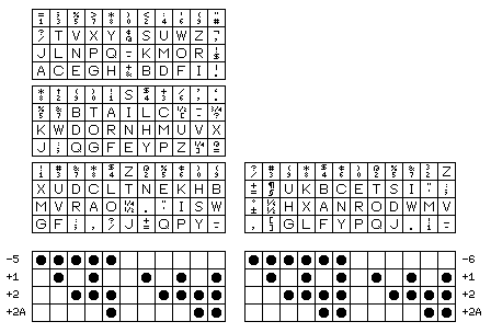
Rather than working out the best arrangement for an 88 character element formed as a 96 character element with one column omitted might be, however, as there are reasons to use an alternate element design that will come up in a later section of this page, attempting to design a new element arrangement will be deferred until then.