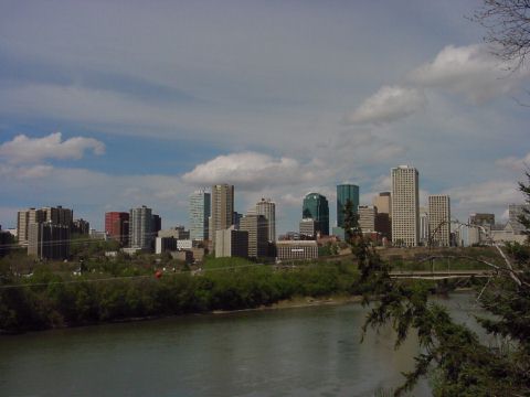
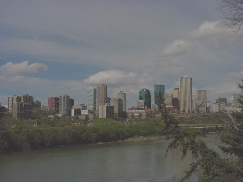
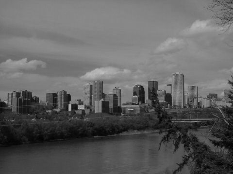
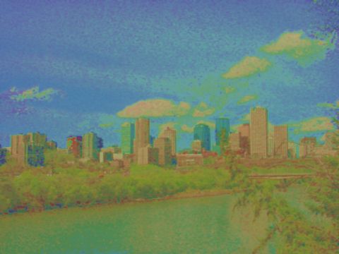
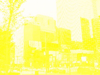
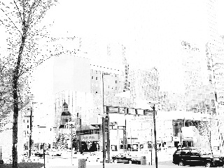
Here is a photograph of the Edmonton skyline in which the buildings themselves, particularly to the left of the picture, are somewhat underexposed.
I've chosen this kind of picture as a starting point to illustrate a problem with color photography that is not found in black-and-white photography. When looking at the world in which we live, our eyes can adjust to considerable contrasts between light and shade, considerably greater than can be recorded on film.
In black and white photography, changing the contrast of a photograph to fit it within the dynamic range of any reproduction medium is a simple and standard procedure. With color photography, it is much more problematic.
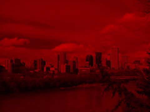
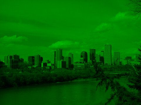
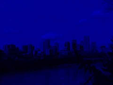
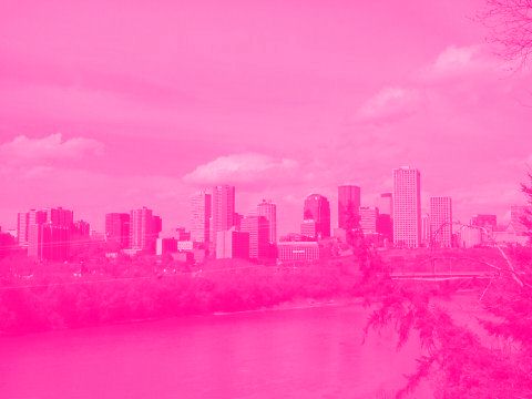
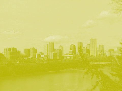
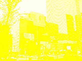
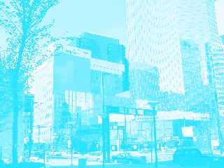
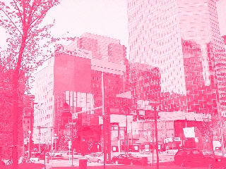
This is because an image on color film contains three separate images: the colors of the image are preserved by recording the amount of red, green, and blue light in each part of the scene.
If one separates the red, green, and blue portions of the image, they look like this:
On a color TV screen or monitor, red, blue, and green light are added together to produce the final image. Color film, however, does not glow, so instead of starting with a black screen, and adding red, green, and blue light to produce the desired mixture, one has to start with white paper, subtracting red, green, and blue light from what is reflected.
Thus, three subtractive primaries are used, cyan, magenta, and yellow. The cyan dye is intended to reflect green and blue, but absorb red, so the amount of that dye controls the amount of red light in the image. Similarly, magenta dye is intended to absorb only green, thus controlling the amount of green light in the image, and yellow dye is intended to absorb only blue, controlling the amount of blue light in the image.
Separate cyan, magenta, and yellow images would look like this.

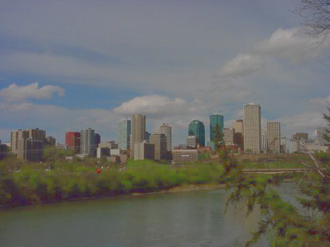
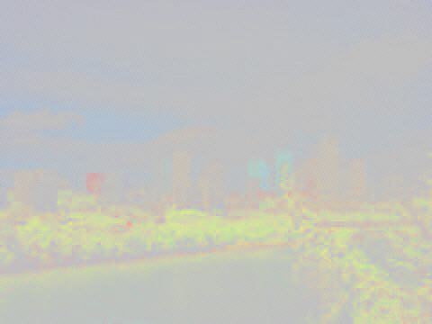
Either way, if one reduces the contrast of each color separately, a reduced-contrast version of the original image looks like this:
Colors have become washed out; less noticeably, the hue of some colors has actually been shifted slightly.
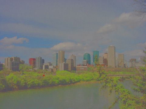
If one overlays a color image with a negative black-and-white image of the same scene, or if one processes the image with a computer, however, it is possible to reduce the contrast between different points of the image in overall brightness, while maintaining the color at any given point. For the same exaggerated contrast reduction used above to exhibit the problems that limit contrast control, here is an image made this way:
This is significant for a number of reasons.
Since we see in color, a black-and-white rendition of a scene strikes us as unnatural, and concentrates our attention on the technical limitations of the medium conveying it to us.
Contrast control is important, because strong contrasts between light and dark are important to some types of subject matter. The brilliant use of contrasts in black-and-white photography is what distinguished the painstaking photographer Ansel Adams.
Cinematography is also affected, since contrasts of light and dark can add atmosphere to certain scenes. Of course, for a movie, contrasts between light and dark areas of the scene can often be reduced through the skillful use of fill-in lighting.
This kind of image can be thought of as being achieved by separating the colors of the source image in a different way.
It is easy enough to think of a color image as having a black-and-white portion:
If one tries to imagine what a color image would look like with the black-and-white part removed, however, because it isn't meaningful to talk about the hue of dark areas, such an image hardly makes any sense:
The best one can do to illustrate these principles, and yet still provide a comprehensible image, is to reduce the contrast of the black-and-white part of the image even more severely than in the example above to create an image that shows the color with only a weakened remnant of the black-and-white part to give it some context:
As our color image needed three different colors to represent it, we might suspect that the color part of the image can be split into two components. And that is true. One of them is a seemingly minor, yet important component: saturation or chrominance, which indicates how vivid and colorful the image is at any point. This component is not too difficult to separate out, as it behaves a bit like the black-and-white part of the image:
Because it isn't too difficult to show separately, an image containing only the saturation, with the black-and-white part of the image completely suppressed, instead of being merely reduced in contrast, is possible, although there isn't much to see in such an image:

Particularly difficult to show separately, though, is the component of the image one normally thinks of when thinking of color: the hue, which determines if the image is red, or blue, or yellow, or green, or orange, at any given point. This is because this value becomes meaningless when either the luminance or the saturation is low. With the contrast of the other components reduced, but not eliminated, and with additional precautions taken to remove visual artifacts caused by rounding errors in the paint program used, my illustrative image for color becomes:
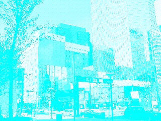
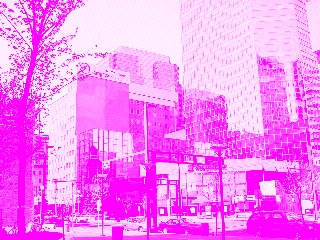
Using another image as an example, to split it into cyan, magenta, and yellow components would produce a result like this:
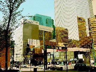
but a more realistic division into these components, based on colors more like those actually used as printer's inks, and including a layer of black ink as well, would produce the following:
With digital imaging, however, the limitation that changing the contrast curve of an image must alter the ratios between the component colors no longer exists. Brightness can be edited independently of hue and saturation.
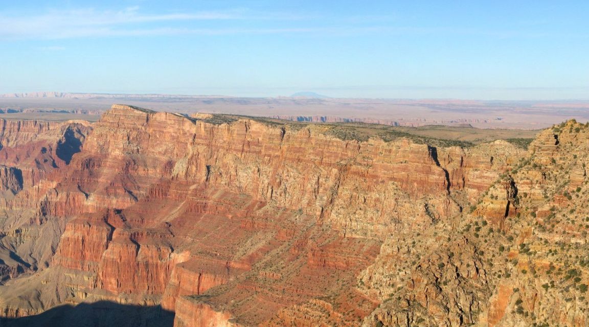
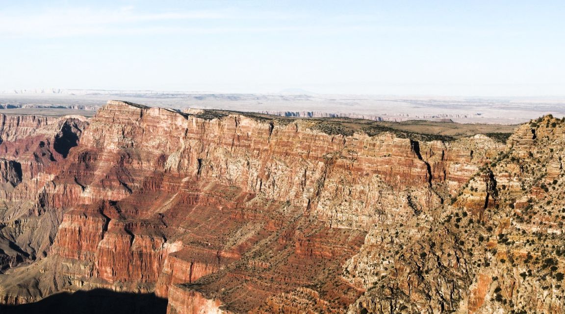
Let's start with a detail from a National Parks Service photograph of the Grand Canyon from Navajo Point:
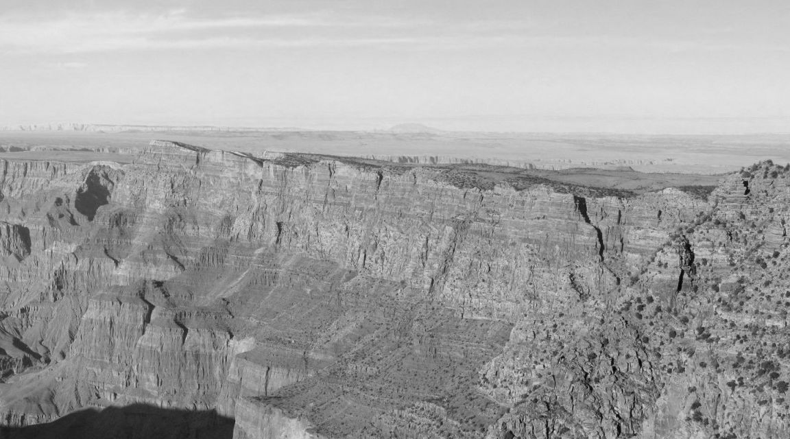
Separating out the luminance component from the image yields this black-and-white image:
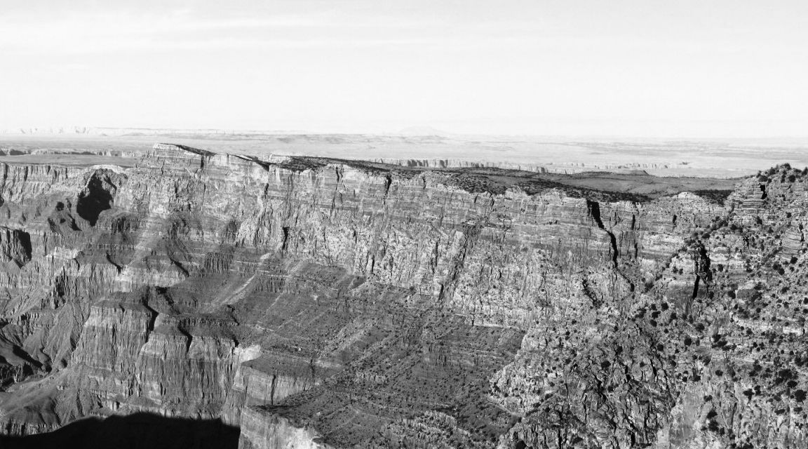
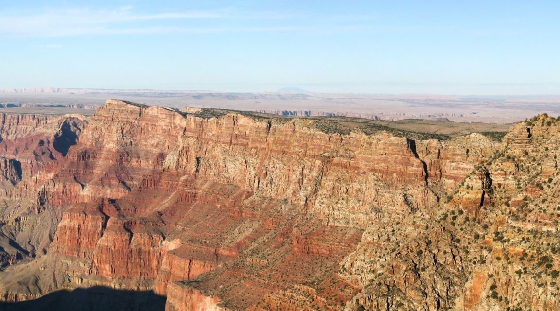
While I certainly don't claim to have a half, a tenth, or even a scintilla of the taste and artistic ability of the great Ansel Adams, the manipulations of a black and white image that he performed with his famous achievement, the Zone System, are now trivial to perform in many image editors. One can simply bend a transformation curve for brightness, or another parameter, as one chooses.
And so, I took this black and white image, and tried to modify it in a way vaguely reminiscent of his work:
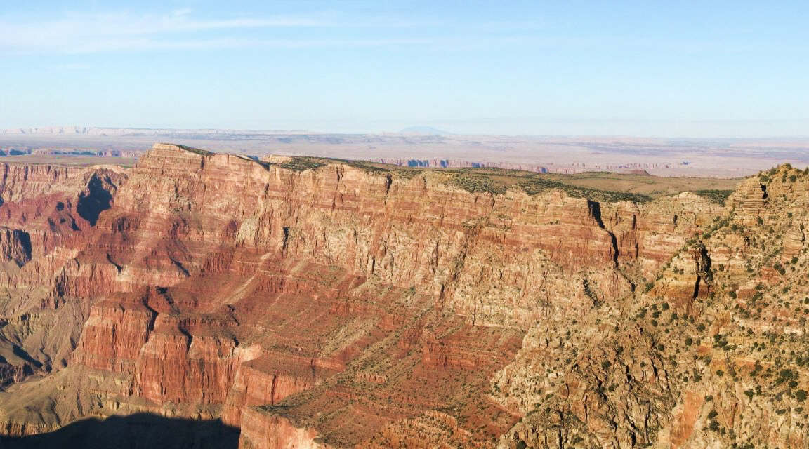
And then I took that black and white portion, and combined it with the hue and saturation components of the original color image, to use the magic of digital photography to apply, to a color photograph, a technique which in film photography, could only be applied to black and white photographs.
Here is the result:
At least when I first saw it, I felt that instead of being an improvement on the original, it was terrible. It looked artificial, like a black-and-white photograph someone had hand-painted to give it colors.
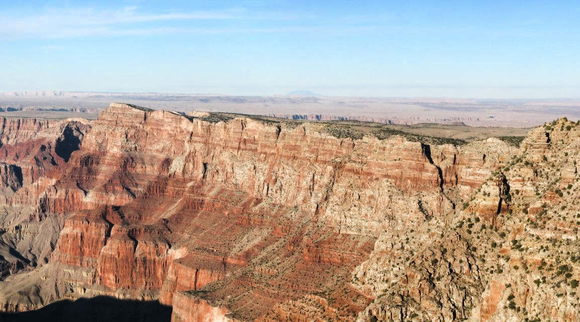
But I then took this image, and mixed it with the original, choosing a proportion by eye, and I obtained this final result:
which, to my eyes at least, seems to be a legitimate "punching up" of the contrast of the original image that no longer gives an unnatural appearance.
The idea behind this approach is to allow the contrast and brightness of the photograph to be adjusted without changing the colors. Leaving the hue untouched is necessary for this result. But leaving the saturation unchanged isn't quite right; areas of the image that have become very bright or very dark should have their saturation reduced.
I made an attempt to apply this principle, and got the following result:
Of course, though, with image editing software, there are all kinds of other strange things that one can do with an image. As just one example, the image below was generated

by first separating the original image into red, green, and blue channel images, then mixing them together in unequal proportions to produce a black-and-white image that provided greater contrast in selected portions of the image. Then, that black-and-white image was substituted for the luminance channel in the original image, to produce the result seen above.
And then I went even further. Splitting the original image into red, green, and blue channels again, first I adjusted the curve for each one of those images individually, and then I mixed the three black-and-white images together to taste. Then I used that to replace the luminance channel of the original, again to avoid changing the colors.
The result,
again somehow accidentally managed to capture the aesthetic of very early attempts at color photography.
Copyright (c) 2002, 2006, 2026 John J. G. Savard