The title of this page is reminiscent of that of another page in a completely different section of this site, which deals with the tonearm of the Garrard Zero 100 and related turntables.
I was not sure where to put this page on my site, and I have settled for putting it here, as an aside to my pages on computer keyboards.
The keys on the IBM PC bore legends in the typeface Helvetica. A few older keyboards also had legends which were in the style of one or another typeface as used for printing; some from Tektronix and Hewlett-Packard come to mind.
But the most common style of printing on the keys of computer keyboards prior to 1981 was for the letters to resemble... technical lettering, as used in drafting.
Or, more explicitly, they looked as though they were drawn with a Keuffel and Esser LEROY® lettering set.
A number of items of associated trivia have come up in my researches into this issue.
One of them is this:
The keyboard of the IBM Selectric® typewriter includes legends that indeed appear to be derived from technical lettering. But they differ in some details from the most common style of lettering as provided by the LEROY® lettering kit.
One of these details is the shape of the numeral 3; it is rounded on top instead of flat. This is a relatively common variation.
Another is the shape of the letter G, which has a vertical line on the right side going down all the way to the baseline. This is not common at all.
The lettering style on the Selectric® is not unique to it; instead, it is also found on IBM typebar electric typewriters; Model B, Model C, and Model D... and even on their Electromatic® typewriters.
The commercial Simpliciter Sans typeface from Cercurius, designed by Lars Törnqvist happens to have both of those distinctive characteristics.
Also, there was eventually a lettering style for the LEROY® that did have that form of the G; it was based on the typeface News Gothic. But it didn't become available until the 1970s.
A simple and inexpensive way to assist in drawing letters is a lettering stencil.
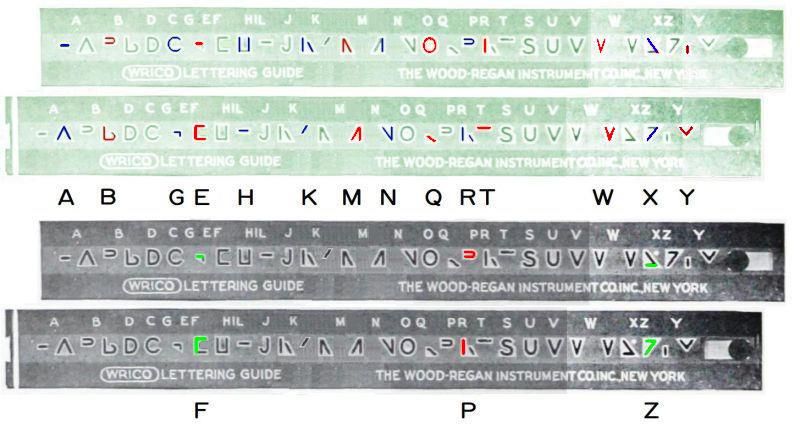
The Wood-Regan Instrument Company, better known as WRICO, went one step beyond a plain stencil by splitting some letters into two parts. In addition, when this was done, the two parts of the letter were separated by a standard distance, and there was a stop at the right side of the stencil (actually called the "shift button") that could be held against the paper to facilitate sliding the stencil against a ruler by the right distance.
This principle is illustrated by the diagram below, which shows the construction of all the capital letters that are built from two parts:
Cautionary note on this diagram: it is based on an illustration from WRICO advertising, as it appeared in a drafting equipment catalog. That illustration used a photograph of an actual WRICO lettering guide, but a segment (extending between the letters K and N) was omitted, which I rebuilt by retouching the image. Therefore, that portion of the image will not be completely accurate.
But to return to the topic which gives this page its title...
To begin at the beginning, there is the DINgraph of Heinrich Kassebaum, dating from 1920, which I learned about from this fascinating article on Typotheque. It was the original embodiment of the principle most familiar from the LEROY® line of lettering equipment. The scriber originally lacked the plastic grip over its metal parts, and the other noticeable difference is that the horizontal groove which guided the pivot pin of the scriber belonged to a frame in which the lettering guide in use was placed, instead of being a part of each lettering guide.
Lettering guides for the DINgraph often had two alphabets on them; to keep them in the same relatiion to the guide groove, one was upside-down on the other side of the guide.
Incidentally, the Typotheque article also mentions the Polynorm, another lettering device from sometime in the 1920s, which was based on a true pantograph.
The diagram below:
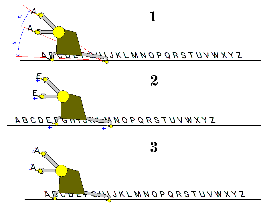
illustrates the principles of its operation.
Part 1 of the diagram shows why the letters on the template bar have a reverse slant, and why adjusting the arm with the pen can change the letters from normal to italics. Basically, since the scriber, when in use, involves a rotation about its pivot point for its motion, if the tracer pin, and the pen position, are separated by a given angle from the pivot point, then what is drawn would tend to be rotated by that angle.
Part 2 of the diagram shows that horizontal lines, however, are reproduced as horizontal lines in an accurate and un-problematical fashion; here, there is no rotation about the pivot point, it just slides forwards and backwards.
Part 3 of the diagram, though, examines the most intriguing question about this type of instrument; after all, it is not really clear that it should work at all. Part 1 of the diagram shows that circular arcs involving a pure rotation about the pivot point are rotated by the right amount to give letters their desired slant.
But is there any reason to expect vertical straight lines, or diagonal straight lines, to be reproduced accurately?
Here, we see what is going on: a diagonal line, like a vertical line, combines a short and thus shallow circular arc with small amounts of correcting horizontal motion; at a different position, the correcting horizontal motions will not be exactly right, but the differences will be very small, so as not to be noticeable in lettering.
This type of lettering instrument was very popular.
Even Keuffel and Esser, to segment the market and make sales to those for whom their LEROY® lettering sets were too expensive, also made an incompatible DORIC® line of lettering sets on the same principle.
Templates for the DORIC lettering set had alphabets in different sizes on the same guide one above the other; if one thinks of a large letter having smaller parts, one can see that this is feasible, one just has to move the ruler on which the guide slides to a different position relative to the baseline. Another difference was that the DORIC templates were molded plastic, so the guide groove and the letters were the same color as the background, while on the LEROY® set, the lettering and guide groove were engraved past the white surface to a black layer for better contrast and visibility.
One German company that made lettering sets of this design was Filler & Fiebig, later renamed Standardgraph after a line of lettering templates they also made; their earlier set was called the Duograph, and much later they sold one as the Stano-Script. Staedtler-Mars also included this kind of equipment in their lineup, and that was were the Mars in the name came from.
The Typotheque article also mentions a Techgraph made by Comet; a search shows the Comet Tech-Graph as an Alvin product; perhaps Alvin was their distributor in the United States. This one, like the original DINgraph, had the guide groove in a separate template holder rather than on the templates themselves. Unlike the DINgraph, it put multiple alphabets on a single guide one above the other like those on the templates of the DORIC set, but it did so in addition to putting one or more alphabets upside down; so on one template, for example, it had the largest of three alphabets going one way along one edge, and two smaller alphabets upside-down relative to the first one going the other way along the other edge, thus keeping the alphabets as close together as possible, while still putting quite a few on one template.
As well, WRICO made their own version of this type of lettering equipment as well (I didn't notice at first, but their guide groove, like that of the original DINgraph and the Alvin Comet Tech-Graph and the Zephyr, was in a holder for the lettering guides rather than on each guide itself); and, for that matter, Keuffel and Esser also made lettering templates; of course, that is not surprising as nearly every maker of drafting equipment made this common and popular item.
Other makers of this type of lettering set (turned up from a quick visit to eBay®) included TechGraphic (with their University lettering set), Trident (with their Trinor lettering set), Lutz, the Frederick Post company also famed as distributors of the Versalog® slide rule made specifically for them by Hemmi (even if it was also sold in Canada by Hughes-Owens, with their permission), Gramercy, Unitech and Hope. Of course, some of the companies here may have been re-selling products made for them by another supplier.
Those closely resembled the LEROY® lettering set; the Zephyr lettering set was like the DINgraph and the Alvin Comet Tech-Graph in having the guide groove in a separate lettering guide holder.
Copyright (c) 2021 John J. G. Savard