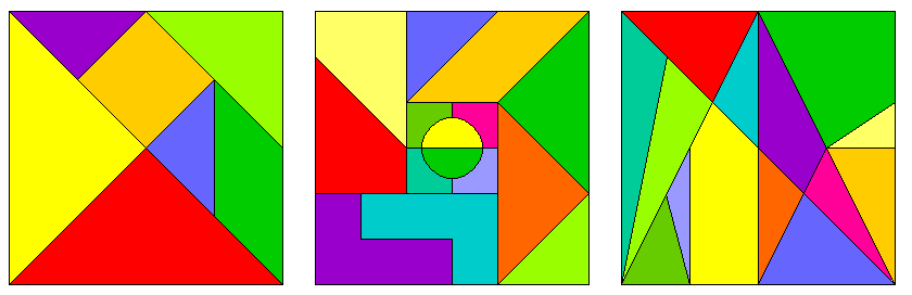
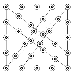
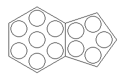
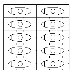
The diagram above shows three squares made up of tiles with different shapes. The first one, on the left, is, of course, the ancient Chinese puzzle known in the West as Tangrams, and in Chinese as Ch'i Ch'iao Pan (qiqiaoban).
The second one, in the center, is also of Chinese origin. The fifteen-piece version of the Tangram was invented by T'ong Hsie-Keng (Tong Xiegeng) in the nineteenth century, to which he gave the name Yi Zhi T'u (Yizhi Tu).
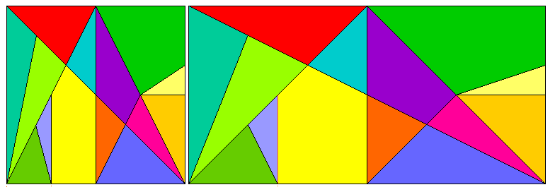
The third one is of ancient Greek origin. Archimedes, in his work The Method of Mechanical Theorems mentions this puzzle, except his version is stretched out to double the width.
As that may be the correct version, both versions are shown in the diagram below:
 |
The image above is from Wikimedia Commons, licensed under the Creative Commons Attribution Share-Alike 4.0 International License, and is thus available for your use under the same terms. Its author is Meisenstrasse. |
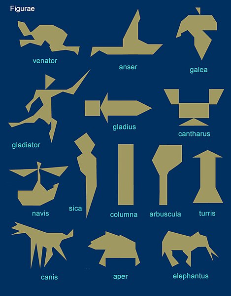
According to Wikipedia, classical texts attest to the pieces of this puzzle, known as the Ostomachion, being used to make silhouettes of various things, in the same fashion that the tangram pieces are used.
To demonstrate this, I have included one image that is not my own on this page at right, from Wikipedia, of the kind of figures that can be made with these pieces.
This, however, makes it obvious that it is the rectangular version of the puzzle from Archimedes is the correct one.
The square version is not without its uses; it served as a puzzle, the object of which was to put the pieces back into the square shape. There happen to be a large number of different ways in which that can be done.
Fortunately, though, it is obvious that the pieces in the rectangle may be reassembled to fit into a square, and thus uniformity with the two versions of Tangrams of Chinese origin may be attained:
While fourteen different colors are used to make the pieces in the diagrams easy to distinguish, of course given how they are used, in an actual set, all the pieces will be the same color.
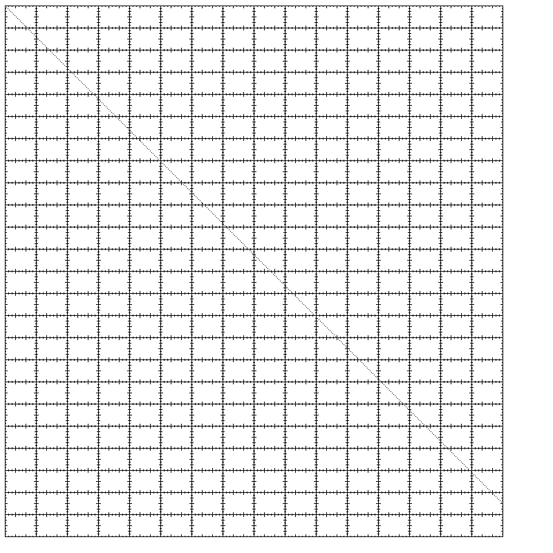
This diagram illustrates how it is possible to make a square, if you can make straight bars with evenly spaced holes.
Each corner of the square must be a right angle, because it is braced with the famous 3-4-5 triangle.
But if squares exist, since every square has a diagonal, then the diagonals of squares exist. And a diagonal is a line, and every line has a length.
So how can you say that irrational numbers, of which the square root of two is one, don't exist?
 |
The image above is from Flickr, licensed under the Creative Commons Attribution 2.0 Generic License, and is thus available for your use under the same terms. Its author is Steven Coutts. |
When I was growing up, when one went to the supermarket, and looked for maple syrup, there was one brand of maple syrup. The same company also made a less expensive maple-flavored syrup, Old Tyme Syrup, but that, of course, had many competitors. However, just recently, I noticed that it was no longer available; it stopped being available, apparently, in 2002, while Old Tyme Syrup continued until 2015.
So, now, in Canada, one will see several different brands of pure maple syrup on the store shelves.
A YouTube video by Oficina Maker, titled "How to Make a Perfect Fit Cement Block", featured an ingenious design for an interlocking cement block, as shown in the diagram below:
The blocks hold together horizontally, and can turn around corners.
The circular area in the middle not filled in is simply to make the blocks lighter in weight than they would be if they were made of solid cement. And, of course, that also allows the cement to dry faster when making such blocks.
For me, that raised a question, however: could the blocks also be made to interlock in the vertical direction? Looking at how alternating layers could overlap,
it seemed to me that the most obvious way to provide for that would be to allow the hollow circular area to also serve as an indentation, and to make a raised ring of cement in the part of the block that would be above or below it in alternating layers.
Here is an image of what the computer of the future might look like:
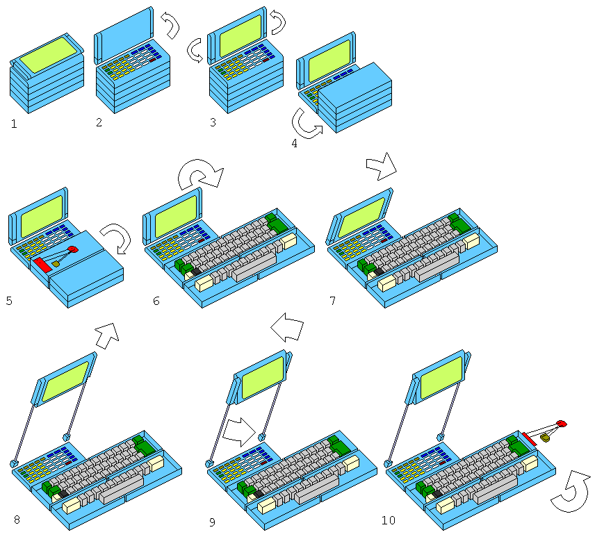
First, at (1), it can be used like a smartphone, although it's somewhat thicker than a normal smartphone.
In (2), one lifts up the smartphone part like a lid. The diagram doesn't show the hinges that hold things together here. Uncovered by lifting the lid is a calculator keyboard.
In (3), the screen is rotated to face forwards; the top and bottom of the smartphone part hold the screen in place. Now, with the screen facing forwards, and the calculator keyboard available in front of it, the device can be used like a programmable calculator.
In (4), the bulky part underneath the calculator keyboard is moved forwards, rotated on a hinge under the front of the calculator keyboard.
In (5), a hinge in the middle of that bulky part is now used to unfold that stack into two halves.
In (6), the top of each of those halves is unfolded to the side. Now, on top of each of the four segments of the pile is part of a full-size typewriter keyboard, and a mechanism causes some of those parts to slide over so that the keyboard is properly arranged.
In (7), the smartphone part of the unit is tilted a bit forwards.
In (8), most of the smartphone part is pulled upwards, held up by telescoping rods that are now expanded.
In (9), the central portion of the smartphone part, the one that was flipped forwards in (3), is now tilted just a bit back, to become vertical again.
In (10), a mouse held on a double-parallelogram drafting machine apparatus, the underside of which was briefly visible in step (5), is unfolded from under the top left corner of the keyboard. Now, the unit can be used as a desktop computer, one that is easily portable!
Actually, this final step is no doubt one step too far; a mouse assembly of this type would, no doubt, be fragile, and significantly shorten the life of the unit as a whole. Instead, plugging in a small mouse carried separately would be preferable. Even the whole full-size keyboard assembly should be easily replaceable, rather than an integral part of the unit, for much the same reason.
And here is a photograph from an old drafting supply catalogue of the sort of drafting machine of which I am thinking, after which the mouse assembly is designed,
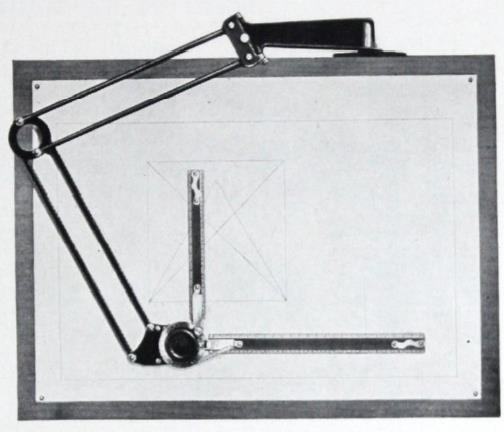
to make it more clear what I am talking about, and what its operating principles are.
Incidentally, a mouse designed on ths principle will need a special button so that it is possible to move the mouse without moving the cursor, since this can no longer be accomplished merely by lifting it up from the surface on which it moves, such as a mouse pad.
However, even in the future, not all computers will be portable. What about the desktop computer of the future?
One obvious and possible improvement in desktop computers in the future would be to put a small computer inside the keyboard, so that if one was going to sit down and just check one's E-mail or do some casual web browsing, it wouldn't be necessary to even turn the computer on.
Related to this was an idea some computer manufacturers briefly tried, where the BIOS contained a very simple operating system that could be used for Internet browsing, so that one could start up the computer, but choose not to boot the operating system from the hard drive.
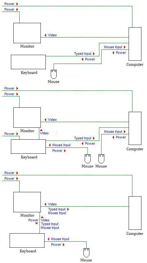
In the image at the right, the diagram at the top shows how a desktop computer is typically connected today.
The diagram in the middle shows what connections would need to be added if one put a computer inside the keyboard that could be used without needing to turn the primary computer on, and one changed the connections in the obvious and naïve manner. What would happen with the mouse? Presumably there would have to be one mouse for the computer, and another one for the keyboard!
The diagram on the bottom shows how things could be improved, if the monitor and computer were designed for the ground up for this kind of configuration.
Here, there is no wall wart supplying power to the keyboard. Since it is connected to the monitor to supply it with a video signal, that same wire could be used both to power the keyboard, and to accept keyboard input that the monitor then passes along to the main computer when it is used.
It's obvious how the mouse would be dealt with by following this principle: there would be one mouse, it would plug into the keyboard, and mouse input would be passed along to the main computer through the monitor as well.
Next, I shall turn to explaining one of the most enigmatic, baffling, and puzzling objects of yesteryear:
the rotary telephone dial!
Some young people of today, strange to relate, when confronted with one, are unsure of how to operate a telepone with this type of human interface.
I shall attempt to remedy this lack.
As with dialing by dual-tone multifrequency (DTMF) signalling ("push-button dialing") it is necessary to lift the receiver and await a dial tone before starting to dial the telephone number of the party you wish to reach.
For each digit of the number to be dialed, follow these steps:
Of course, even an old telephone is still connected to the present-day telephone network, and so one will have to dial the three-digit area code before dialing the seven-digit number nowadays, due to changes made in the system of area code dialing to accomodate an increased number of telephones on the North American continent, resulting in nearly all areas having to adopt ten-digit dialing.
Also, note that the finger-hole positions corresponding to successive digits are each separated by an angle of 30° one from the next, but the position to which a finger-hole is moved when the finger reaches the finger stop is separated by 60° from the position corresponding to the digit 1. Thus, when the dial is released, it moves about 30 degrees before generating pulses, thus ensuring a uniform pulse train despite imperfections or irregularities in the release of the dial or the position of the finger in relation to the finger stop.
It was on November 16, 1963 that Bell Telephone announced the introduction of the Touch-Tone® phone which gradually displaced the rotary dial.
The very earliest dial telephones, made under the Strowger trademark, Almon Brown Strowger being the inventor of the automatic telephone exchange,
only used less than half of the circumference of the dial for all the dialing positions, and they had an eleventh position, generating eleven pulses, to dial in order to contact the operator for a long-distance call, instead of using the digit zero for that purpose. Also note that the finger stop is further away from the hole representing the digit 1, giving the dial a looser tolerance for a slow start.
On this page there is a picture of a unique Strowger telephone; in front of a dial of the type depicted here, an additional dial, with holes in all 26 possible positions, is placed, which is connected to a rachet so that it can only be turned clockwise. In this way, while the dial can be moved back counter-clockwise by the spring to send pulses, one can only push it clockwise with the finger, so this was intended to prevent incorrect dialing.
No doubt you have heard the famous story about how necessity was the mother of invention in this case: Strowger's original business was as the operator of one of two funeral homes in his town, but his competitor's wife was the town's telephone operator.
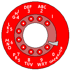
Strowger's Automatic Electric Company introduced the modern "small dial" in 1907; while the illustration above of a modern telephone dial is based on a Bell System telephone, the Bell System did not adopt automatic dialling until 1919. While this was the year when the original Strowger patent expired, this was a coincidence, as some three years before, Bell paid several million dollars for the right to make use of the Strowger patents. Unless, of course, they lost the receipt.
However, the Automatic Electric "small dial" was different from the one later offered by Bell:
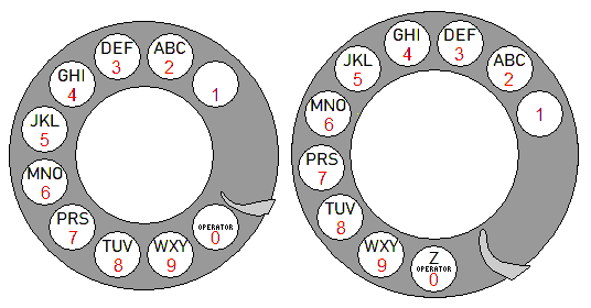
The type of dial on older Bell phones is illustrated on the left, while the style of dial used on Automatic Electric phones is illustrated on the right.
The much more familiar Bell style has ten holes, spaced as to belong to twelve possible positions, two of which are unused. The finger stop lies two positions clockwise from the clockwise edge of the hole for the number 1.
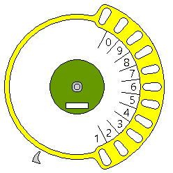
The Automatic Electric dial, on the other hand, has thirteen hole positions, of which ten are used. Instead of the finger stop being at the edge of the most clockwise unused hole position, it is in the middle of that hole position.
Also, the letter "Z" is marked on the dial: this conflicts with the use, by the Bell system, of ZEnith numbers for toll-free numbers that can only be reached with the aid of an operator and not by dialing.
An interesting transitional form between the older Bell System dials and the newer dial used on the classic Model 500 telephone
![]()
is the dial used on the Model 223G payphone, which puts the numbers outside the dial, but in the style of the numbers within the finger holes on the older dial.
One thing that motivated me to draw the dial of the 223G payphone to illustrate a transitional phase between the older dial and that of the Model 500 is the fact that on this page, as the second telephone from the bottom, a Stromberg-Carlson telephone which closely resembled the Model 500 in some respects, despite being a wall phone, but which had a dial with the geometry of an Automatic Electric dial, was shown which also used horizontal lettering rather than lettering positioned to surround the numbers in a circular fashion. On this page is depicted another phone from Stromberg-Carlson, this time a desk telephone, with horizontal lettering as well.
Incidentally, Automatic Electric began offering its Monophone in different colors in 1929, but the Model 500 telephone of Western Electric, used on the Bell System, was not made available in different colors until 1954: however, the earlier Model 302 telephone was available in different colors in 1949, so the Bell Telephone System did introduce color to its phones a bit earlier than the best remembered date.
Also incidentally, the city in which I live, Edmonton, Alberta, was the first city in Canada, in 1907, to enjoy automatic dialing thanks to Automatic Electric equipment.
Of course, at that time, telephone numbers didn't have the form with which we are most familiar: a three-digit exchange, followed by four digits for the number proper. Thus, in 1909, for example, Edmonton telephone numbers were simply four digits long - and they could start with a "1", since, when dial telephones were not universal, obviously there could be no such thing as Direct Distance Dialing.
But as recently as 1953, Edmonton telephone numbers still did not have the conventional form; instead, they were simply five digits in length! Of course, even in the early 1960s, people still contacted a telephone operator to make long-distance calls, so this was not as bizarre as it might seem. As far back as 1925, there were five-digit telephone numbers in Edmonton, but both five-digit and four-digit telephone numbers coexisted at that time.
The Edmonton telephone system had one unusually modern feature in 1953: a number of emergency services could be contacted by dialling a three-digit number, but one starting with a "1", instead of one ending in "11". This form of three-digit dialling for special services was first implemented in the United States in 1968, but it took years for it to become widespread; it first became available in Canada in 1974.
There is an additional discussion related to telephones on this site at this page, including some information on how other countries placed letters in association with the numbers on the dial.
On another page, I discuss digital magnetic tape recording. Also, in discussing 5-level code and ASCII, my diagrams include the paper tape formats associated with these codes.
However, there isn't quite enough to say about paper tape formats to fill a page... although this particular paper tape format might be complicated enough.
However, I'm not quite enough of an antique collector to be an expert on these. However, hunting around and finding different sources on the Web enabled me to compile the information for the diagram above.
One of the biggest companies in the player piano field in the United States was the Aeolian company, which trademarked the term Pianola, and which later made the Duo-Art line of player pianos.
In December of 1908, a meeting between the major companies that made player pianos took place at the Iroquois Hotel in Buffalo, N.Y., which led to an agreement called the "Buffalo Convention", standardizing the format of piano rolls for player pianos with a full gamut of 88 notes, to use a hole spacing of 9 holes to the inch, and to use the same 11 1/4 inch (or, from one source, 11 9/32 inch) width of roll as used for existing Aeolian piano player rolls with a 65 note gamut and a hole spacing of 6 holes per inch, which had been to some extent the de facto standard of the industry, although there had been many incompatible formats of roll for player pianos in use up to that time.
There was controversy over the choice of a 9 hole per inch spacing. While the older piano rolls, with a spacing of six holes per inch, could be kept in alignment through normal mechanical design of the piano, a nine hole per inch spacing (but not necessarily an eight hole per inch spacing) would make it necessary for the piano to dynamically align the piano roll through some type of self-correcting mechanism.
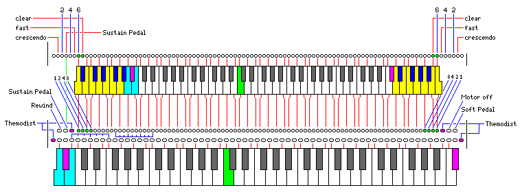
Aeolian player pianos had a trademarked feature called the "Themodist" where one position on each side of the player piano roll (usually activated by a distinctive pattern of two small holes instead of one hole) indicated that any notes struck at the same time as indicated by that hole would be emphasized. Each position governed the notes on one side of the piano, so that specific notes in the main melody or theme, and specific notes in the chords or accompaniment, could be independently emphasized.
Another relatively common player piano feature was a pointer that the operator of the piano could slide across the roll to follow a line printed on it which indicated how the tempo of the music should vary during performance.
The Aeolian Duo-Art player piano, in addition, also allowed the user to either play normal 88-note piano rolls, or, by switching over some pneumatic connections, to reserve the positions corresponding to the bottom four notes, and the top four notes, of the piano for use to indicate how forcefully the notes of the theme and accompaniment would be struck in general. 16 levels were available for both.
The position on the left-hand side shown as used for the sustain pedal appears to have been used on other types of player piano as well which did not have other reproducing piano features. Also note the position on the right-hand side for the soft pedal.
The diagram shows how the notes on an 88-key piano correspond to the hole positions on a player piano roll, including how the 65-note gamut fits into the 88-key gamut of a piano, and how a modern 61-key keyboard fits within that 65-note gamut. Yellow and blue keys are those on the 88-key keyboard and not the 65-key keyboard; cyan and purple keys are those on the 65-key keyboard and not the 61-key keyboard. Middle C is indicated by making that key green.
The top part of the diagram shows the expression system offered by Ampico. There were three holes on each side used to determine the force with which notes were struck; they were labelled 2, 4, and 6 based on their hole positions. They also added in a binary fashion, having the values 1, 2, and 4, but the result of the addition then related to the force with which the keys were struck according to one of three response curves, which could be selected by a lever, so that the instructions given with a particular piano roll could specify either a larger range of dynamics, or a finer control over dynamics, would be used with that roll.
These holes caused the level to latch; another hole, considered to be in position 7, cleared the level. As well, there was another expression control, crescendo, and the speed with which it went on or off was controlled by the hole marked fast. The original Ampico design had independent crescendo functions for both sides of the piano, but this was later replaced by having only one crescendo.
Note that the use of hole 3 on the left for the sustain pedal put this in about the same position as used on Duo-Art pianos.
Working Ampico reproducing pianos are scarcer than Duo-Art reproducing pianos, as, according to a web site I have seen, it is more difficult to restore them well enough to produce acceptable results, although originally both kinds of player piano were fully comparable.
|
|
|
|
|
|
In Canada, for an extensive period of time, the game Monopoly (a trademark of Hasbro; then, of course, of Parker Brothers) was sold with relatively conventional wooden game pieces, rather than metal tokens. As this set of pieces is relatively obscure outside Canada (although for brief periods wooden pieces, some of which were similar, were used in the U.S.) I have pictured it here.
I believe this set of pieces was also used with sets for the game Clue, also a trademark of Hasbro at this time.
The above image has been split, with a part in black and white, to prevent fraudulent use in online auctions.
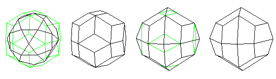
A little mathematical artwork I've come up with; I call it The Electric Dodecahedron.
I was a bit disappointed that no Archimedian solid includes both octagons and pentagons. And so, after some thinking, I came up with this shape:
Start with the 30-sided rhombic triacontahedron, and put an octagon (shown in green) on each of its diamond-shaped faces. Where three obtuse angles of the diamonds meet, an equilateral triangle (shown in yellow) is formed. Then, by suitably joining other corners of the octagons, a decagon (shown in red) with alternating long and short sides, still having pentagonal symmetry, is formed. The shape is less elegant than an Archimedian solid, as there are left-over isosceles triangles (shown in white) with narrow bases present as well. There are 30 octagons, 20 equilateral triangles, 12 decagons with alternating sides, and 60 narrow isosceles triangles in this shape. Since only the octagons and decagons are large shapes, this could form the basis of a somewhat imperfect 42-sided die, having pentagons and bilaterally-symmetric, but not regular, hexagons as faces. Perhaps if they ever make the Hitchhiker's Guide to the Galaxy into an RPG, they might use such a shape. Having seen this interesting site, however, I thought perhaps it might have already been done, but it seems not to have been.
The shape depicted, however, is indeed one that has been previously known; it is designated as I(*,1,4,e) in a paper on "symmetrohedra" by Craig S. Kaplan and George W. Hart.
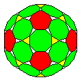
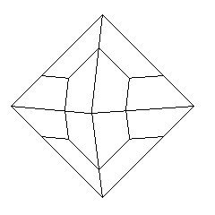
Speaking of useful shapes for dice, since 7 times 20 is 140, and 5 times 12 is 60, and 140 plus 60 is 200, one could start from the shape of a soccer ball, following this principle:
and obtain another imperfect die, but one that it seems could be made quite close to a regular design, with 200 faces.
And finally, after a long delay, is a sketch of how such a die might actually look:
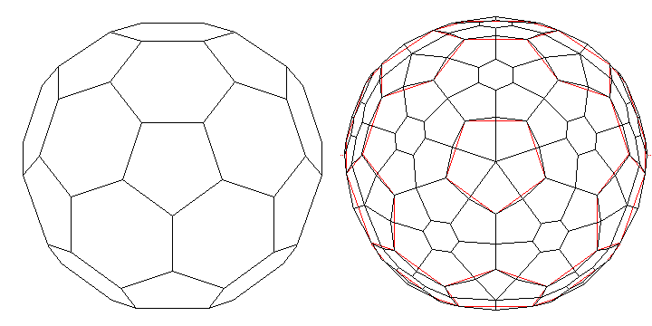
First, on the left, is an image of the truncated icosahedron, the shape that is the starting point. Then, on the right, the truncated icosahedron is shown in red as being the skeleton, on which a pyramid of five trapeziums is built on each pentagon, and a truncated pyramid of six irregular pentagons, with a regular hexagon in the center as the top of that pyramid.
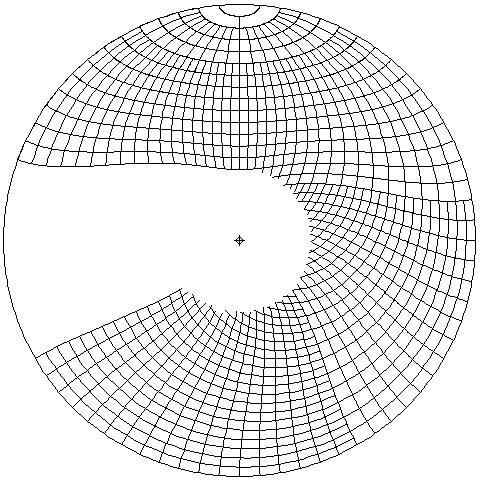
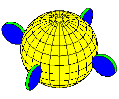
Here's an image of the graticule of a very clever circular slide rule for vector addition. Basically, take polar-coordinate graph paper, and bend it around into a circle... this is the Jensen aircraft computer.
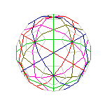
This image shows how five sets of three great circles can be disposed symmetrically about the sphere, using the "soccer ball" Archimedian polyhedron as the base.
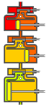
To the right is a picture of the cylinder of a steam engine. A valve lets steam in on one side of the cylinder, and lets spent steam out on the other side of the cylinder. Since the piston moves from one end of the cylinder to the other as it is pushed from one side, and then back again pushed from the other, the motion of the valve has to lead that of the piston by 90 degrees in phase.
If you remember pictures of steam turbines, you will recall that there are many layers of vanes, each one larger than the one before. This is to continue extracting energy from the incoming steam as it gradually loses pressure. Reciprocating steam engines, particularly when used on ships, could do the same thing by having three cylinders, in each of which the steam lost part of its heat and pressure, before the spent steam was pulled from the last one by the condenser. The picture at the right illustrates such an arrangement. The smaller the change in the pressure and temperature of the steam in each cylinder, the closer the cycle approaches reversibility, which is the condition for the maximum theoretical efficiency, that of the Carnot cycle.
All the cylinders must operate in the same phase, simply because as the wheel turns, the piston is at a position, and moves at a speed, proportional to a trigonometric function of the phase. The cylinders are illustrated at phases spaced by 120 degrees to show more of the operation of the engine.
But the real secret of how a steam engine works is not visible anywhere on the diagram at right, and usually is not mentioned in most short descriptions of how a steam engine works!
Steam engines on steam locomotives just let the spent steam out of a smokestack as they went along, and frequently obtained new supplies of water. But most steam engines recirculated the water that served as their working fluid.
If you have a hot boiler, out of which steam is coming at a high pressure, then that pressure is the same in all directions everywhere in the boiler! So how do you push the recirculated water back into the boiler?
The short answer is, with a pump. But the next question that might come to mind is how you avoid, then, using up all the energy your steam engine produced in trying to pump the water back in to where it came from.
And the secret of how a steam engine works is this: steam made from water takes up about 2,000 times as much volume as the water it came from. Since the amount of work required to cram something into an area at high pressure is proportional to its volume, because steam takes up so much more volume than water, pumping the water into the boiler only uses up a tiny amount of work compared to what the steam engine produces, even if the steam engine is only 4% efficient in the first place, as was true of the first modern steam engines as invented by James Watt! As the increasing size of the cylinders indicate, though, unlike water, steam is compressible; but even one part in 500 instead of one part in 2,000 is still inconsiderable enough.
A special kind of paper tape, having room for only two holes across, was used for recording Morse code. However, this tape came in two very different forms, which has led to some confusion.
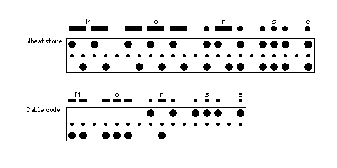
On the top, the Wheatstone form of this tape is shown. This tape used a hole on the top to represent the start of a dot or dash, and a hole on the bottom to represent the end of a dot or dash. This kind of tape, moving at a uniform speed through an automatic sender, would produce dots and dashes in the ideal 1:3 ratio.
On the bottom, the form of tape used for sending messages in cable code is shown. Here, a dot is represented by a current in one direction, and a dash by a current in the opposite direction, or down another wire, each taking an equal time. In a sense, cable code isn't "really" Morse code, but it used the existing International Morse Code as its basis, rather than inventing a new code. When in use, this tape also moved at uniform speed through transmitting equipment, which made such equipment incompatible with any attempt to use it to transmit conventional Morse code.
Both tapes are shown with the name "Morse" encoded on them. Of course, Morse himself only invented the American Morse Code, not the International Morse Code; it might be possible to coax the latter from a Wheatstone device, but a code with different lengths of dashes is quite incompatible with cable code.
And here is
the message encoded in the stones of the Great Pyramid: "The Pharaoh is cheap and wants a 15% discount whenever he buys cloth".
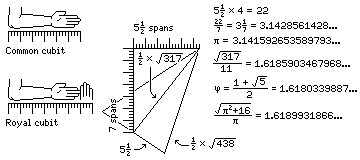
That is: the slope of the Great Pyramid seems to have been based on pi, but that is just a coincidence, made possible by the fact that the height of the Great Pyramid was measured in royal cubits, each one seven palms in length rather than the normal six palms, and for each royal cubit in height, it sloped inwards by five palms and two digits. Five-and-a-half over seven, of course, is one quarter of 22/7, the famous approximation to pi.
The Nubian people also constructed pyramids; they were much smaller than the Egyptian pyramids, which inspired them, and, as a result, they were more sharply pointed in their shape.
Their walls are inclined at an angle of about 70° above the ground. This could be closely approximated if they used the same system as the Egyptians used, but with an inward slope of two palms and two digits for a height of one royal cubit of seven palms. That would give an angle of about 70° 20′ 46″ 14′′′.
Speaking of the Great Pyramid: recently, archaeologists uncovered a record by Merer of day-to-day events connected with its construction. It turns out the blocks from which the Pyramids were built were quarried in Tura, and canals from the Nile to the Pyramid site were constructed to allow the boats to bring the blocks to where they were needed.
Of course, the Pyramids were built by conventional means; the blocks were pulled by large teams of workers up inclined planes of earth, on rollers made from logs. The workers were Egypt's farmers, conscripted during the rainy season, when their farms were flooded and they would have been otherwise idle.
Of course, there are many who claimed otherwise. A popular theory these days is that aliens in flying saucers came here and used their advanced technology to construct the pyramids. It seems an odd thing for a technologically-advanced race to do; one would expect them to build office buildings instead.
But such speculation has been around long before Kenneth Arnold saw flying objects that "looked like saucers skipping over a pond" in 1947, leading to the term "flying saucer" entering the language.
Before alien technology entered the picture, it had been proposed that the stones from which the pyramids were built were made to float through the air by magic. A papyrus with a magical inscription was bound to each stone, it was tapped with a metal rod, and musical chants then made it float!
The place where I first read that fanciful description did not cite a source, but I have now come across the responsible party. It turns out that Abu al-Hasan 'Ali ibn al-Husayn ibn 'Ali al-Mas'udi was the source for this claim.
In fairness, it should be noted that al-Mas'udi was simply citing statements about the origin of the Pyramids from the various sources available to him; it was only those who came much later who uncritically claimed that the story about magical levitation was the truth of how it really happened.
I always thought that the traditional values of poker chips were something like those shown in the first line below:
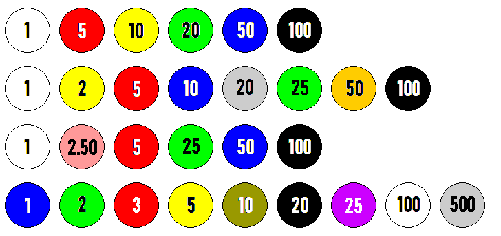
However, online, I find that instead the usual color code for home games is the completely different one on the second line.
However, the one commonly used in casinos, shown in the third line, is somewhat similar to what I imagined; and then the fourth line shows what is instead used in poker rooms in California.
Of course, if one speaks of color coding for denominations, one might also speak of money. Although, in the United States, all the denominations are printed in the same color, green!
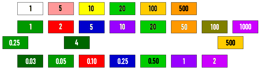
On the top line are shown the colors of money with different colors for different denominations of the type most familiar to Americans: Monopoly® money!
On the second line are shown the colors used for Canadian money, and on the third line the colors used for some additional denominations used long ago, but no longer current.
And, finally, on the fourth line, the colors used for the denominations of Canada's other official currency, Canadian Tire money! However, the three-cent denomination was done away with at an early point, and the color shown is the original one; later ones were blue, and there were other variations in color as well for other denominations.
Great Britain uses blue, orange, purple, and red for its notes in 5, 10, 20, and 50 pound denominations; formerly, the one-pound note was green, and the 10-shilling (half a pound) note was red.
Since Hong Kong at one time had banknotes in the denomination of one cent, I looked into it to see if it had an extensive series of denominations in different colors. I found that wasn't the case; but I also learned that its bills of higher denomination were printed by its major banks. In Canada, at one time, our major commercial banks also printed the paper money we used, but that is over a hundred years ago.
Only recently, at a local shopping mall where other merchants are occasionally allowed to set up tables to sell merchandise in flea market style, I noticed a series of Argentine currency that would have been what I was looking for:
      1 Orange           500 Green            100000 Dark Green
      5 Blue-green      1000 Brown            500000 Green
     10 Dark Green      5000 Greenish Blue
     50 Dark Brown     10000 Light Red
    100 Blue           50000 Dark Brown
although I'm not sure I'm describing some of these colors correctly, and the color of the 100 peso note was changed to red.
Note that because the series was so extensive, they didn't bother with 20 peso or 200 peso notes.
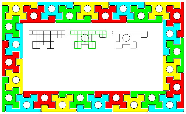
In the illustration below, first you see a line with a ? as the prompt, and then a BASIC statement with line number entered by the user.
This shows how a simple character-oriented display on a terminal works, with the screen divided up into a grid of characters, all of equal width, as would be made by an ordinary typewriter (as opposed, say, to a proportional-spacing IBM Executive typewriter).
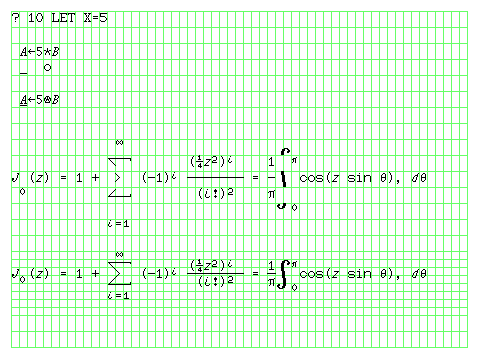
Many terminals supported the APL language, but in general, those video terminals (as opposed to printing terminals, which could simply overstrike on the paper) that did so were designed by one computer manufacturer for its own computers, and had special characters representing the overstrikes that its dialect of APL used.
The next group of lines shows, however, that if a display had two pages of text memory, and a suitable character set (presumably, two copies of the ROM containing it would be needed), then the use of an OR gate could allow arbitrary overstrikes. The idea had been thought of, but there was not enough demand, apparently, for any terminal manufacturer to make such a terminal.
The third group of lines shows that I feel they were not imaginative enough. If one has two pages of text memory, were one to have a somewhat extravagant character set (including superscript characters, and italic characters in both normal and superscript forms) and overstrikes at an offset of one-half of the height of a line (a characteristic, in fact, of most typewriters, so that one could select 1 1/2 line spacing), then one could actually display, without going to a full graphical display as is used with today's graphical user interfaces, mathematical formulas in all their glory, as I show with the definition of a Bessel function, which allows me to show both a sum and an integral.
In the example shown, it is assumed that there are only superscript characters, and subscripts are achieved by using those characters in the row half a line down. This would conflict with the fraction bar when superscripts are used in the numerator expression, so that is not really a reasonable assumption.
Some character (rather than graphic) terminals, such as the HP 2645, did provide a special character set for displaying equations, but they did so with conventional character spacing.
This was inspired by the 4-line Mathematics feature which Monotype provided for its typesetting equipment.
Mathematical notation was difficult to set in movable type. The 4-line mathematics feature did not eliminate all the difficulties, but it did simplify several parts of the process.
A Monotype caster produces individual pieces of type as called for by a punched tape produced by a Monotype keyboard. This means that, unlike Linotype, while it allowed type to be set largely just by typing the text to be set, it also provided the same flexibility, if required, as could be obtained by setting type by hand.
The most dramatic benefit of the Monotype 4-line mathematics feature was that it allowed a variable to have both a superscript and a subscript at the same time. This was achieved as follows:
A line of mathematical notation was allowed 12 points of space. Normal characters were in 10-point type, superscripts and subscripts in characters the size of those of 5 1/2-point type, and second-order superscripts and subscripts were the size of 3-point type.
Characters were, however, cast on a 6-point body, not a 12-point body.
This meant that that the typesetter needed to type the line of mathematics twice, holding down a shift key to blank out characters which belonged to the other 6-point half of the 12-point line. It also meant that when regular-sized characters were cast, part of the character had empty space below it instead of a type slug; this, called "kerning", takes place in the horizontal direction instead of the vertical direction for letters like an italic lowercase f in normal typesetting.
This, in itself, was not an unprecedented feature. Even the Linotype machine allowed one to place double-height characters on single-height bodies; this was done to allow prices to be more prominent in advertisements otherwise set in small type, and so the high characters were called "advertising figures". Because of this, it was possible to typeset simple mathematical formulas, such as might be needed in high school textbooks, on a Linotype. But the Monotype, with much greater flexibility in spacing, was the only choice for publishing advanced textbooks or scientific journals which required essentially an unrestricted ability to typeset mathematics.
Placing larger characters on smaller bodies allowed one of the two typings of a line to include superscripts, and the second typing to include subscripts. It also meant that only two copies of a character were needed, rather than four, to allow superscripts and subscripts to have their own superscripts and subscripts - which could still be typed directly in the line, instead of being added later.
In addition to the direct benefits of the technique, Monotype 4-line mathematics was significant because it involved the creation of new fonts of characters for mathematical composition in Times Roman. Previously, mathematical typesetting on the Monotype tended to be done in Modern No. 7.
A new set of italics was designed for the Monotype Times 569 as distinct from the regular Times Roman font, Monotype Times 327. The lower-case italic v was changed so that it would be more distinct from the Greek letter nu, w was changed to match it, and g was changed to have the shape used in hand printing rather than the double-loop shape used in many printed fonts. As well, all the italics were redesigned to be less slanted, to reduce cases where extra spaces would need to be inserted due to horizontal kerns.
From the Book of Ezekiel, chapter I, verses 16 and 17:
The appearance of the wheels and their work was like unto the color of a beryl: and they four had one likeness: and their appearance and their work was as it were a wheel in the middle of a wheel.
When they went, they went upon their four sides: and they turned not when they went.
In a mechanical computer mouse, the ball that moves when the mouse is moved on a surface is within wheels that sense its vertical and horizontal movement; a mouse, unlike a toy truck, is not rotated when one changes from moving it up and down to moving it from side to side. Could the Prophet Ezekiel have been describing something based on a similar principle?
Of course, a normal wheel, rather than a ball, that can itself turn, being gimballed within a wheel, is another possibility; that which the wheel bears does not turn, but the wheel itself can.
Another mystery from the Bible concerns the 144,000 sealed, 12,000 from each of the tribes of Israel, who are standing in a square. While 144 is a square number, and so are 100 and 10,000, 1,000 is not a square. So how can 144,000 people be standing in a square array?
Well, they don't need to be standing in a rigid grid formation. Thus, the illustration above shows a checkerboard pattern, in which a grid is formed from small, square-shaped clusters of ten people. 14,400 such clusters would make a square with 120 such clusters on each side.
Also, when people are standing up, they're usually wider than they are thick:
Admittedly, though, a 5:2 ratio is perhaps a bit on the large size.
But then, that could be where the factor of 144 comes to our rescue!
144 is 12 times 12. But it's also 4 times 3 times 4 times 3... so it's 16 times 9.
And 16 is not equal to 9, it's bigger than 9. So let's take that, and mix it together with the 5 to 2 ratio so as to moderate it... 16 times 2 is 32; 9 times 5 is 45.
Thus, one can have a square in which each person is placed in a rectangle giving 45 units of width and 32 units of depth - and they stand in 45 files in 32 ranks, forming a square.
Each such square would contain 1,440 people, and so a hundred such squares, in a 10 by 10 array, would be a square with 144,000 people.
Here are 16 files, and 24 ranks along those files, with a dotted diagonal line showing that 16 files wide is the same as 22 and a half ranks deep.
While on the topic of refuting the Biblical naysayers, it might be noted that while a molten sea, ten cubits from brim to brim, would indeed have a circumference of 31.14159... cubits, a molten sea 9.5 cubits from brim to brim would have a circumference of 29.84513... cubits; thus, a molten sea with a diameter anywhere between 9.5 cubits and 9.70845... cubits would have a diameter from 29.84513... cubits to 30.5 cubits, and thus it is entirely possible for a molten sea ten cubits from brim to brim to be compassed round about by thirty cubits if one is rounding to whole cubits.
In ancient Egypt, at least, there were six palms (about 3") to a cubit (about 18"), and there were four digits (about 3/4") to a palm; in ancient Israel, these divisions were also used, with a palm being translated as a handbreadth (Tephah), and the digit as a finger (Etzba), in the Bible, and, in addition, half a cubit, or three handbreadths, was called a span (Zeret). The cubit itself was an Amah in Hebrew, and that was sometimes translated as an ell in some versions of the Bible; however, while the original length of the ell was indeed half a yard or eighteen inches, that name was given to a unit of one yard and nine inches, which would make that translation confusing. As the size of human hands has not changed much since ancient Egypt, 3/4", or 19.05 millimetres, is also the normal spacing between keys on a typewriter (or computer) keyboard.
Using these units, here is a table covering the range of interest.
Diameter                 Circumference
cubits palms digits      cubits palms digits
  9      3                29      5     0.283125
  9      3     1          29      5     3.424718
  9      3     2          30      0     2.566310
  9      3     3          30      1     1.707903
  9      4                30      2     0.849496
  9      4     1          30      2     3.991088
 10                       31      2     1.982237
Note that a molten sea nine cubits, three palms, and five digits across is compassed round about by less than a hundredth part of a digit less than thirty cubits and three palms. Thus, pi is close to 732/233.
An objection to this has been raised on the basis that the Bible, in describing the dimensions for the Ark of the Covenant, used half-cubits, and 30.25 divided by 9.75 is less than pi. However, there is no particular reason for there to be only one precision used in describing lengths, particularly as the lengths described there were all shorter than ten cubits: two and one-half cubits long, one and one-half cubits high and one and one-half cubits wide.
However, this particular rationalization may properly be viewed as unsatisfying. When people make things, they usually make them in exact round dimensions that are easy to measure. Thus, if Solomon had his workers make a basin that was ten cubits in diameter, one would expect that it would be ten cubits in diameter, not one span and three digits short. Of course, the truth of God's Word should outweigh our merely human assumptions.
Then, should the Bible have instead said that a line of thirty-one cubits, two palms, and two digits did compass it round about? To our modern way of thinking, that it could be compassed round about by a line about one fifty-sixth of a digit shorter than that would be an inexactitude that could be tolerated. After all, it did say that such a line would "compass" the molten sea, and a thing can be fully enclosed by something that is bigger than required.
If the wording permits error in one direction, however, perhaps we could also consider that "a line of thirty cubits" might not mean "a line thirty cubits in length", but instead "a line at least thirty cubits in length". When we say that an adult is a person "eighteen years of age", we don't mean that nineteen-year-olds are no longer adults.
Incidentally, the verse described a bath built in Solomon's temple. Thus, it wasn't a sea of molten metal; rather, it was a basin of cast metal.
There is some more to be said on this topic.
In the Septuagint, the circumference of the "molten sea" is given as thirty-three cubits in this verse, while it remains thirty cubits in 2 Chronicles 4:2.
In the Masoretic Hebrew text of these two verses, the word for "line" is spelled differently; Quoph-Vau in Chronicles, and Quoph-Vau-Hé in Kings. The letter "Hé" is silent. These different spellings of the word have the values in gematria of 106 and 111.
If one multiplies 3 by 111/106, one will get 3.141509..., which is very close to pi.
This could be a bizarre coincidence, of course. It could also be taken as evidence that the Bible was inspired by a God Who knew the value of pi very well. In the latter case, though, even as it shows the Bible to be from God, it is still difficult to reconcile with the view that everything that is said in the Word of God is absolutely true - as one would expect, after all. However, this could be taken, for example, as a vindication of those forms of Christianity which are not literal or Fundamentalist.
If one tries to obtain a good rational approximation to pi by continued fractions, if one adds or subtracts at each step, the next approximation after 3 1/7 is 3 16/113; but if one only adds, as mathematicians do when determining the principal continued fraction representation of a number, an additional approximation appears in between, and that approximation is 3 15/106 or 333/106, the one that appears here, which makes this even more striking.
In Petr Beckmann's book A History of Pi, he notes that mediaeval commentators on this verse suggested that the molten sea was hexagonal, "crudely ignoring the description 'round in compass'". But the Bible simply said that thirty cubits compassed it round about - that is, thirty cubits enclosed it in all directions. It did not, by the use of the word "round", state that its shape was circular. Since it was simply described as being ten cubits from brim to brim, and a circle is the best-known shape that is the same width everywhere, however, a hexagonal shape is unlikely.
And the ratio of the perimeter of a Reuleaux triangle to its constant width is that of half the circumference of a circle with that width as its radius to that width, which is still pi, so that particular solution, also too bizarre to be worth considering, may be discarded (Barbier's theorem shows that this is true for all other curves of constant width as well).
In the book The Quadrature of the Circle by John A. Parker, we are told that, since the perimeter of a circle is always greater than that of any inscribed regular polygon, which is true, the commonly accepted value of pi is in error in the sixth decimal place. Of course, that is nonsense; yes, the inscribed polygon is always smaller, but with enough sides, the error may be made as small as desired - as any mathematician knows quite well.
The value of pi he sought to establish was 20612/6561. At one point in his argument he noted that if two things are different in size, they must differ at least by the size of one "ultimate particle of matter"; for this to lead to an error in a particular decimal place, however, one must also limit how big a circle can be.
The particular ratio he chose resulted from his choice of the equilateral triangle as the primary shape composed of straight lines, while the circle was the primary shape in Nature, and the proper standard of area, rather than some estimate of atomic diameters as against the size of the Earth. At one point, although I can't find it again, I had thought I read in his work that there should be one standard of length for straight lines, and another one for curved lines.
By that rule, one need not stop at making pi equal to 20612/6561; one could have a straight cubit and a curved cubit that make pi equal to three - and with Biblical authority to boot. Of course, there is precedent for having two kinds of cubit, as we have seen above (and a long cubit of seven handbreadths is also mentioned in the book of Ezekiel in the Bible). Since twice pi is about 6.28, which is much less than seven, a molten sea of ten cubits from brim to brim would be easily compassed round about by twenty-seven (or, more precisely, 26.927937...) long cubits, and thus this could tell us that the thickness of the brim of the bath was just under half a regular cubit (0.488934... cubits).
The Septuagint gives 33 cubits as the circumference of the bath; this adds one part in ten, however, rather than one part in twenty-one, so it is not as if 30 long cubits equalled 33 regular cubits. A circumference of 33 regular cubits would have led to a brim with a thickness of just over a quarter of a regular cubit (0.252113... cubits), and a brim of about four and a half inches would be quite reasonable.
This does not resolve the capacity of the bath being 2,000 baths in Kings and 3,000 baths in Chronicles; most commonly, this is accounted for by the peck of liquid measure and the peck of dry measure being referred to by that unit in the two different places. Using both would make it unambiguous what its capacity was, and if the volume of the bath were known, the question of whether the cast metal sea was cylindrical or hemispherical could be settled as well.
It is possible that the liquid bath corresponded to 22 litres from one archeological find. Given a cubit of 18 inches, which apparently is actually somewhat too small according to most authorities, a cylinder ten cubits in diameter and five cubits high would have a volume of about 392.7 cubic cubits, 2,290,221 cubic inches, 37,530 litres, or about 1,706 baths. Thus, the sea is more likely to be cylindrical than hemispherical, and the bath used in the time of Solomon would have been a bit smaller, at just under 18.8 litres.
Or the dimensions could all have been in the long cubit of seven handbreadths, in which case 2,709 baths would have been the volume of the sea if it were cylindrical. Two-thirds of that would be the volume in the hemispherical case, or 1,806 baths.
As for dry measure, 15.6 to 17.7 kilograms of flour are noted in Wikipedia as having the volume in question of one Ephah. A cup of flour weighs from 120 to 130 grams, or 4 1/4 to 4 1/2 ounces, and so it may be possible to estimate this volume as well, at least well enough to determine if it is the larger or smaller of the two. And from those figures, apparently the Ephah of dry measure is somewhere around 30.5 litres, making it the larger unit, and making a 3:2 ratio between the two units entirely plausible.
And so a cylindrical bath, with a volume of 2,000 dry baths or 3,000 liquid baths, measured according to a long cubit of seven handbreadths, where the short cubit of six handbreadths is somewhat larger than 18 inches, achieves consistency with the volume given.
In the novel The Library of Babel, author Jorge Luis Borges describes a library filled with every possible book, in which members of a religious order search for a book which makes sense.
The library is described as being made of hexagonal rooms, with a circular opening in the floor, surrounded by a railing, with a corresponding hole in the ceiling, serving for ventilation.
Each room is said to have bookshelves on four sides, and an opening into a vestibule which proceeds to another room with books on another side; this vestibule has a bedroom and a washroom on either side of it. In the middle, there is a spiral staircase by which the other floors of the library might be reached. (Some translations vary this description from that which I have paraphrased here.)
If we assume the remaining side, not described, is the simplest thing, a doorway directly into another one of the rooms with shelves, it might be that the plan of the library is something like this:
In this way, except for whether the bedroom is counterclockwise or clockwise from the washroom, each of the rooms with bookshelves in the library could be identical to each other room, as long as the direction to the vestibule rotates uniformly from one floor to the next, and rooms with bookshelves can be only above and below other rooms with bookshelves, while vestibules can be only above and below other vestibules.
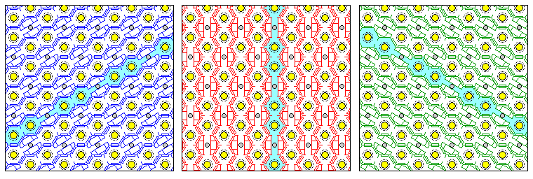
However, I received an E-mail from David Shalcross, who I thank for helpfully pointing out that there is a flaw in the design above; while motion in all directions is possible, one can only get to every third row of hexagonal chambers on any level through the spiral staircases.
Fortunately, there is a way to correct this simply enough:
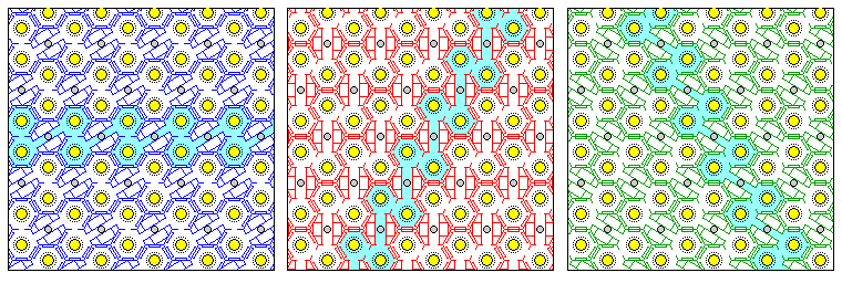
If the door between library chambers is on a wall adjacent to the door to the vestibule, then the vestibules are still connected in rows, but now in rows turned 60 degrees clockwise from the rows as they were in the diagram above.
It is not even necessary to use all six kinds of floor; the new rows, since they proceed in a zig-zag path, intersect each and every row, not every third row, of the rows in a different direction on the other floors. (In fact, only two kinds of floors are required to access every room, but all three are required for making the rooms symmetrical.) The old floor style, however, might be useful to facilitate faster horizontal movement.
In each of the three component diagrams in the illustrations above, one of the paths available within each floor is highlighted in a light blue-green color. This change from the initial form of the diagrams helps make the flaw in the first arrangement easier to see.
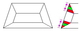
Just in time for Hallowe'en: a trapezohedron whose faces are not trapeziums, but trapezoids - even if somewhat unsymmetrical ones:
Another starting point for this symmetrical 24-sided shape would be to begin not from the rhombic triacontahedron, but from the octahedron:
since it is well known that three trapezoids can be used to make a triangle. So the degree of asymmetry in the trapezoids could be limited by keeping the shape close to that of an octahedron.
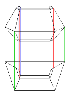
Using only symmetrical trapezoids, one can construct a distorted version of a cube or rectangular prism with two identical faces and two parallel faces, and one can also join two such shapes by their largest face to form a 10-sided solid whose faces are symmetrical trapezoids. The diagram below shows the view of such a shape when looking directly at one of the two parallel faces:
Note how the two tilted trapezoids on the sides, although symmetrical, do not appear to be; thus, on the right side of the diagram, a geometric construction is shown as an aid in overcoming the optical illusion.
Actually, quite a bit of freedom is available in designing such a shape... allowing, for example, an 18-sided solid, or a 14-sided one as shown below.
And, incidentally, the base plan is the plan from the diagram above, just turned upside down (and with a slightly different width), but in this form, the optical illusion of asymmetry is even stronger.
However, from the story The Haunter of the Dark, it is noted that the Shining Trapezohedron is at least roughly spherical in shape, so a clearly rectangular shape such as this is not a possibility.
And while I'm on the topic of H. P. Lovecraft: the state of Massachusetts is justly proud of being the home of Harvard University, in the city of Cambridge, Massachusetts. Harvard's rival, Yale, is located in New Haven, Connecticut. In many of his horror stories, H. P. Lovecraft, an author from Providence, in Rhode Island, adjacent to both Massachusetts and Connecticut, made reference to a ficticious institution of higher learning called Miskatonic University. The Housatonic river is the only river in the area with a similar name, and that river flows through the south-western corner of Massachussetts, and continues through Connecticut to the sea... its mouth being beside New Haven. However, Miskatonic University is located in the ficticious city of Arkham, Massachusetts, said to be modelled on Lovecraft's native Providence, Rhode Island by some, and on Salem, Massachusetts by others. In The Dunwich Horror, both Miskatonic University and Harvard (in the Widener Library) are said to posess copies of the Necronomicon. As it happens, Providence, Rhode Island is home to another Ivy League college, Brown University.
As for the other members of the Ivy League, Dartmouth College is in Hanover, New Hampshire; Columbia University is in New York City, Cornell University is in Ithaca, New York, Princeton University is in Princeton, New Jersey, and the University of Pennsylvania is in Philadelphia, Pennsylvania.
And here is an image of a very common object, generally taken completely for granted, but with some measurements added, measurements that were not easy for me to find:
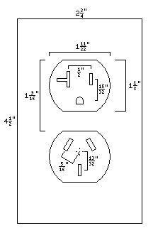
The outlet on the top is the normal one in use in North America, except that I have illustrated the 20 ampere variant instead of the normal 15 ampere one, by making the opening for a vertical prong on the left have a T-shape.
Some older outlets, without an opening for a ground prong, give a similar T shape to both prongs. The reason they did that was because the oldest common form of an electrical plug had the two prongs horizontal. Today, this form of plug is only used for 250 volt outlets, not for outlets with a normal 120/110/100 volt RMS AC supply, and so that form of outlet is no longer made.
The outlet on the bottom is a type currently in use in Australia, Argentina, China and a few other places for 240 volt 50 Hz AC. As this type of outlet originated in the United States as an early form of grounded outlet, before the round pin was added to the existing plug, it was originally used with the same type of faceplate as the conventional North American outlet. Today, this outlet type is usually used with different styles of faceplate because the electrical codes in the countries which use it mandate additional safety features; I show it here because it is the one outlet for European style AC which doesn't necessarily require a completely different form of faceplate than that used in North America.
If I'm going to provide an image of an electrical plug, though, I should also provide an image of something a little more recondite:
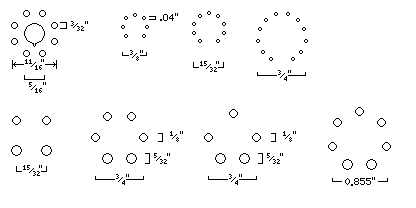
Here are some of the layouts of the pins on the bases of vacuum tubes. In the top row, that of the classic octal tube is given, followed by 7-pin and 9-pin miniature tubes, and then the Compactron tube from General Electric.
In the bottom row, the UX4, UX6, UY5, and UX7 pin layouts which are four of those which preceded the octal base, found on some American antique radios, are shown. In addition to the UX7 base, there was also the USS7 base, which was similar, but in which the pins were arranged on a circle that was 3/4" in diameter instead of 0.855" in diameter.
The classic octal tube was originally developed by General Electric, and first came out in 1935.
As for the antique tube bases, note that the UY5, instead of being based on a regular pentagon, simply combined half of a hexagon with half of a square. The UX7 pins give the appearance of being in the form of a regular heptagon; but, in fact, to make it easier to specify the arrangement, the small pins were spaced at 51° intervals around the circle, while the angle between the two large pins, or between a large pin and a small pin, was 52° and thus 3*52 + 4*51 = 360.
And here's something else...
While before there were 7-segment displays in calculators, whether they used light-emitting diodes (LEDs), or were vacuum fluorescent, liquid crystal, or even electroluminescent displays, other methods were used that produced better-looking numbers, such as Nixie tubes, or even rear projection displays such as were made by IEE (and then there were the sphericular displays made by Burroughs, the company that also invented the Nixie tube), the much lower cost of the seven-segment display swept nearly everything else away.
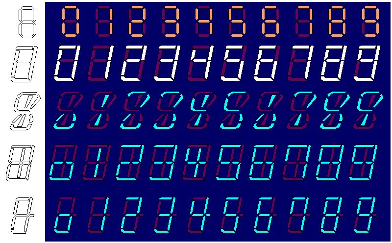
Above is shown, in the first row, what typical 7-segment numbers in a LED display might look like.
Other display technologies, like liquid crystal displays and vacuum fluorescent displays, made it easier to use segments that were of any desired shape. In the second row, one common adjustment to the corners of the 7-segment display to produce better-looking digits is shown, which dated back to the early work with electroluminescent displays.
Then in the third row is shown the 9-segment display offered by Itron, and used in calculators by Casio, Sharp, and Burroughs. The reduced-height zeroes are somewhat off-putting, but otherwise, the digits are attractive, even if of an oddly informal style for things like calculators.
In the fourth row, is an arrangement I recently saw in a photograph of the Burroughs C3263 calculator. Going from a 7-segment display to a 10-segment display allows the digit "4" to be more distinctively displayed; again, the small size of "0" is chosen.
In the fifth row, an arrangement I saw at about the same time in a photograph of a Casio 121-L calculator. This display style is clearly related; again, the "4" has an extended crossbar, but this time it is achieved by adding only one small segment to the display, making it an 8-segment display, just for that crossbar. I presume it was a successor to the 10-segment design in the previous line, intended as an improved but simplified version.
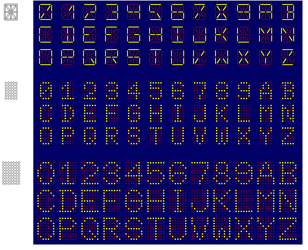
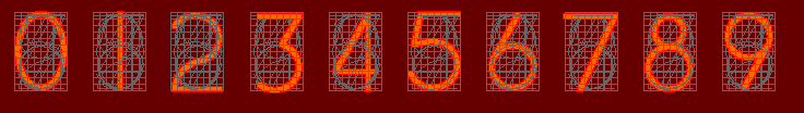
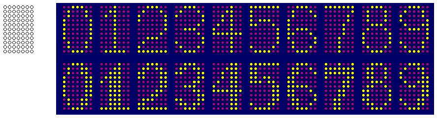
And then, to round out this topic, here are how the digits and the letters look on various types of alphanumeric display: a 14-segment display, a 5 by 7 dot matrix, and a 7 by 9 dot matrix:
Of course, using dots to represent characters, at least dots coarse enough to be visible, still does not do justice to their desired appearance. As far as a numerical display on a calculator goes, here is my attempt to draw an image showing what numbers should really look like on a calculator:
Actually, this would be a somewhat more accurate representation of the actual appearance of the type of numeric display I have in mind:
Or, even more accurately:
But then there are those who will settle for nothing less than this:

Some of those viewing this page, of course, may not necessarily recognize the style of digits in the first three of these four illustrations... and indeed, many of those viewing this page may not recognize what form of display device the fourth illustration attempts to refer to by showing its appearance.
Here, then, is a spoiler link.
Or, for further discussion of both of these display types, you can go here on my site.
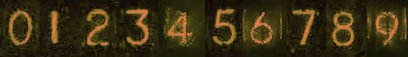
Of course, if one does not insist on perfection, even with just a few more dots, it's possible to suggest more of the proper shape of numbers:
and, indeed, this French-language blog post illustrates some real-life examples of LCD calculators that do attempt to provide digits with an improved appearance.
Even with just the 5 by 7 dot matrix, though, it might be possible to modify the design of the characters to be more suggestive of how they appeared with Nixie tubes, for example, like this:
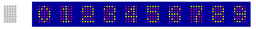
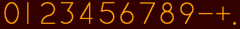
And if I am going to discuss ways of displaying digits, I might as well discuss the digits themselves here, having been prompted to do so by a recent news item.
Our modern system of decimal place-value notation for writing numbers originated in India, and was transmitted to Europe by the Arabs, who had adopted it.
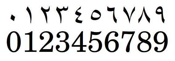
Thus it is that while in the Arab world, numbers are often written using the form of the digits shown in the top row of the diagram above, those in the bottom row, the ones we familarly use every day, are commonly referred to as Arabic numerals.
This recently enabled the newly elected Mayor of New York, Zohran Mamdani by name, to have some fun with those who were nervous about his background, ancestry, or politics by announcing that he would enact legislation to ensure students in New York schools would learn Arabic numerals.
It was so not long ago that the city of Calgary, lying to the south of my home of Edmonton, elected as its mayor one Naheed Nenshi, and, despite Alberta being a conservative province, not too much fuss was made about it.
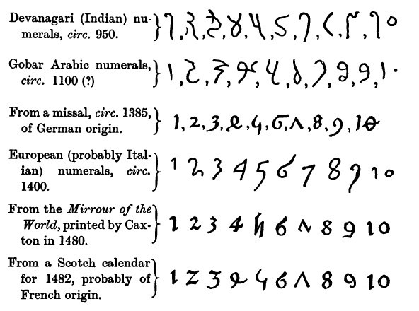
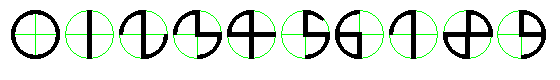
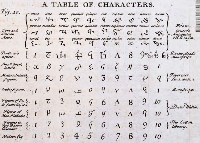
Here, to add further information on this topic, is an illustration of the course of development of our modern digits from an old book on the history of mathematics:
And here is a form of the ten digits which I saw long ago in the Golden Book Encyclopedia.
However, when I looked them up again, I found my memory was playing tricks on me. I had thought this form was presented as the original Hindu form of the digits, but when I looked, I found that instead this form was credited to the ancient Arabs.
And here's another old table of the forms the digits have taken, this one casting about widely for possible origins, examining Greek letters and the Tironian notes:
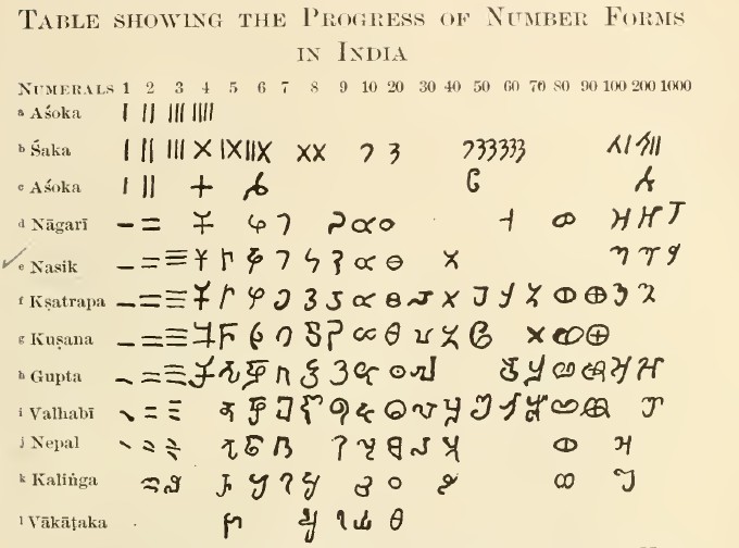
However, we now know where our modern numerals originated; the Hindu numerals which included the digit zero derived from the Brahmi numerals which preceded the invention of the zero, and which had forms like these:
From the same book, a table which might first appear puzzling
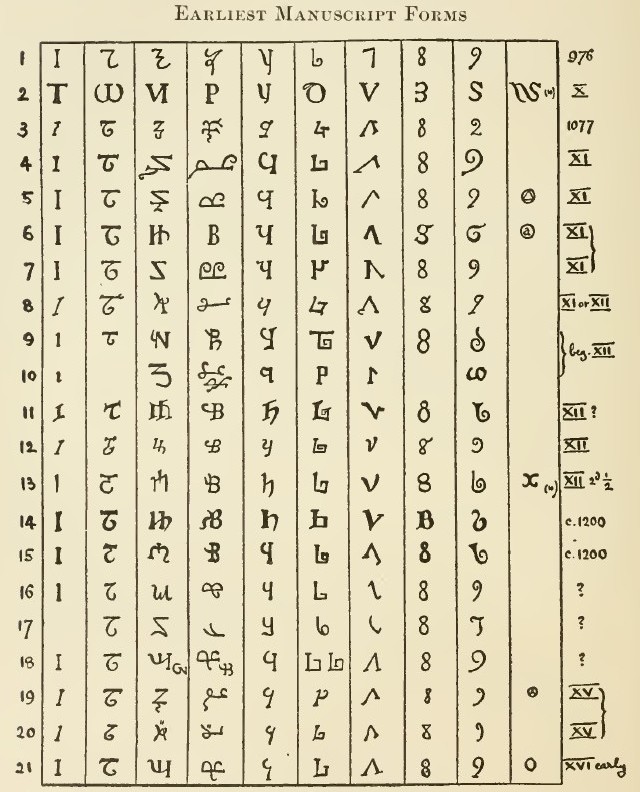
shows many of the earliest forms of the decimal digits after their introduction to Europe. Why it is puzzling is that while the earliest form, from 976 AD, on the top line, shows a clear resemblance to our modern numerals, those below, rather than illustrating a gradual evolution towards the modern form, seem to have, for the most part, gone off into an alien and bizarre direction.
The figures on the bottom line are the apices of Boethius, and that clears up the mystery; these early forms of the digits were used not primarily for speeding pencil and paper arithmetic, but for labelling the beads on abacus - or by labelling conical counters used similarly near their pointy ends at the top, hence the name "apices".
And, finally, as a Canadian, I am often prone to strange attacks of nostalgia.

Here, at left, is a trademark I once saw often on the streets of Canadian cities, along with the sign for Esso - which is still seen throughought Canada, although it has been replaced by Exxon in the United States - and the sign for Texaco, also vanished from our streets.
The photo at right shows a sign at a gas station in Edmonton on which the Esso logo is visible. Below it is a logo that will be very familiar to Americans, that for the 7-Eleven chain of convenience stores. And below that is a sign for a quintessentially Canadian restaurant, Tim Horton's.
And for the American viewers of this page for whom the photo is primarily intended, it should be noted that the price of gasoline noted on the sign, 119.9 cents, is per litre, and not per gallon, a litre being slightly smaller than the British Imperial quart formerly in use in Canada, but slightly larger than the quart in the U. S. Customary system of units.
Tim Horton was a Canadian professional hockey player, who started that restaurant chain when he retired. Sadly, he passed away before it became a big success. The restaurant specializes in doughnuts, also serving coffee, breakfast sausage or bacon with eggs in a bun, and bowls of chili, for example. Although most of its locations are in Canada, it recently started a few locations in the United States.
"Under the sign of the big B-A" went the slogan for the British-American Oil Company. Its gas stations were mostly first rebranded for Gulf Oil, an American company, and then for Petro-Canada, Canada's government-run oil company, which competes against many private oil companies, including Shell as well as Esso.
This came to my mind when I saw the logo for Octan, an oil company that, although it isn't real, has something in common with Esso and Shell... having appeared in sets of plastic building blocks made by that famous Danish company, Lego.
The Octan logo is made up of a green drop of oil and a red drop of oil, in a configuration somewhat reminiscent of the ancient symbol of Yin and Yang as well as the British American Oil logo.
Octan made sense as the brand name for a chain of gasoline stations since it's based on "octane", the hydrocarbon C8H18 which is highly appropriate because of its association with power and performance. In 1997, SGI came out with their Octane line of MIPS-based workstations for this reason.
The octane number of gasoline is defined as the ratio of iso-octane, rather than, as one might expect, normal octane, to normal heptane in an equivalent mixture. Octane being a heavier fraction, it is more resistant to premature ignition, or "knocking", and thus more suitable for use in higher-performance internal combustion engines.
Copyright (c) 2005, 2007, 2008, 2010, 2014, 2017, 2019, 2025 John J. G. Savard