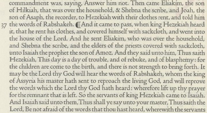
On this page, we will examine one particular typeface which has been used on at least a few occasions to print Bibles, with the intent that a relatively bold face will allow small type to be more legible.
A condensed bold face, with bracketed slab serifs with rounded tips, that is easy to confuse with Clarendon, is Cushing Old Style. This typeface was quite popular as a bold face complementing Scotch Roman typefaces at one time, and because it is bold, it had also been used in some Bibles to permit legibility at small point sizes.
It should also be noted that the typeface Cushing is currently available in digital form.

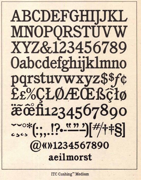
However, the digital versions available are based on ITC Cushing™ (a trademark of ITC) which was modified so as to make it a contemporary typeface useful in advertising. This revival was drawn by Vincent Pacella.
Shown in the illustration is ITC Cushing™ Medium.Below is an illustration of the Bold weight of this typeface in 14 points:
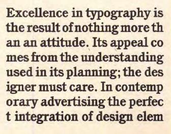
Currently, the Cambridge University Press produces Bibles set in a legible, yet small, typeface of a similar appearance. Advertisements for this Bible note that it was first published during the 1920s.
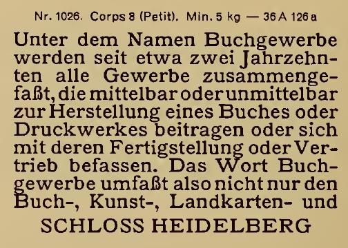
Here, from the specimen book of the Bauer typefoundry, is a specimen of their typeface Mediaeval-Egyptienne, in the 8 point size, also named Petit. Could this be the "Petit Mediaeval Clarendon" that is used in the Cameo bibles published by Cambridge University Press?
The original version of Cushing Old Style was cut by J. Stearns Cushing at the Central Type Foundry:
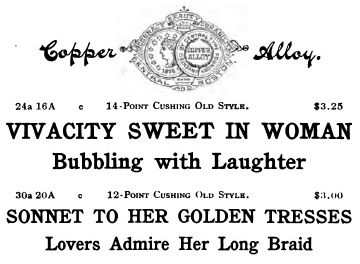
Cushing Old Style, along with Cushing Monotone, Cushing Antique, and a somewhat different face just called Cushing, were offered by ATF after it acquired the Central Type Foundry.
This is their version of Cushing Old Style:

Here is the much lighter typeface which they just called Cushing:
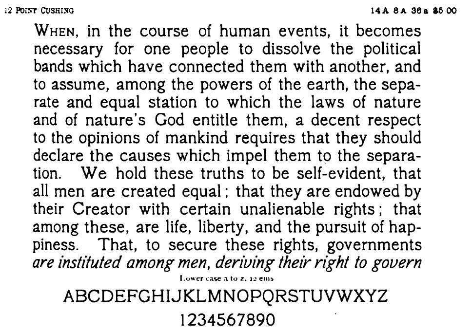
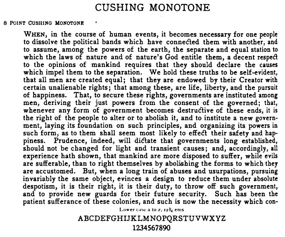
and here is Cushing Monotone. All three of these specimens were in an ATF specimen book from 1900.
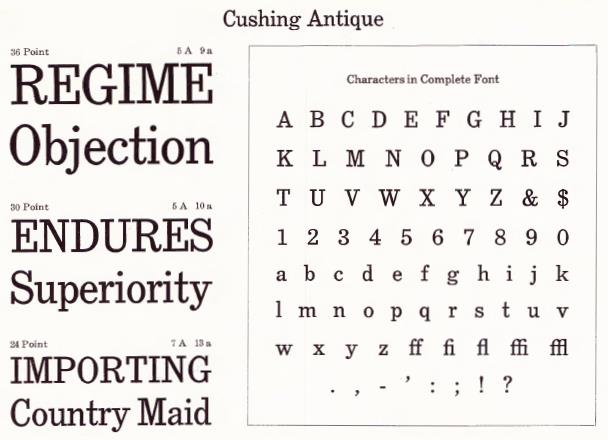
The only member of the Cushing family to appear in the large 1923 ATF catalog was Cushing Antique:
Due to its popularity, the Keystone Type Foundry made their own version of Cushing Old Style, which they called Richelieu:
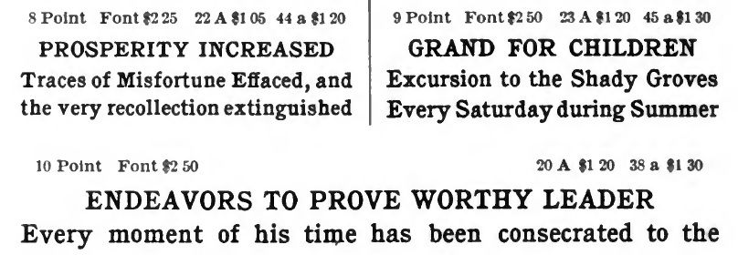
Lanston Monotype, the original Monotype company in the United States, produced a version of Cushing with its style also indicated by the number 25J:
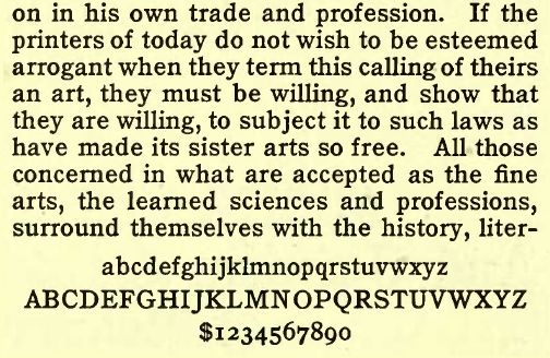
Linotype, on the other hand, named their version Title 1:
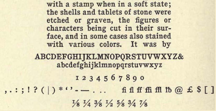
Here is an example of the use of Cushing Old Style to typeset the Bible, from the famed 1917 edition of the Scofield Reference Bible (which followed the King James Version for the text of the Scriptures):
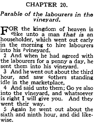
This example, from the 1908 Thompson Chain Reference Bible, seems to me to be similar to a more condensed version of Cushing:
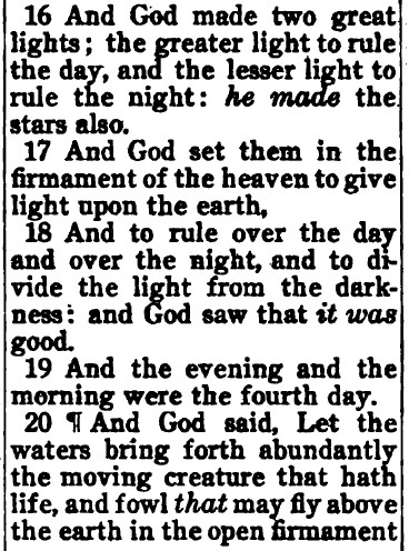
Here is one from a self-pronouncing edition of the King James Bible from 1897, printed by the Oxford University Press, which I am quite confident is set in the typeface of which I am thinking, unlike some of the other examples here, which may not be quite right:
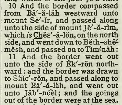
And here it is used for an old Catholic Bible with the Douay-Rheims text:
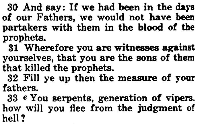
Well, maybe not. Taking another look, this looks more like Century Expanded. It's too early for Corona, but the descenders are quite short; could it be Roman No. 2?
And here is a clearer example of the use of Cushing in a Catholic Bible,
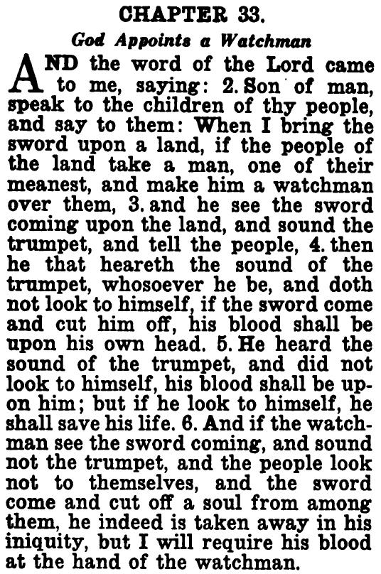
from an early Confraternity-Douay Bible, the New Catholic Edition from 1954.
Just recently, I came across a catalog which contained an advertisement for an inexpensive Bible printed using this kind of typeface:
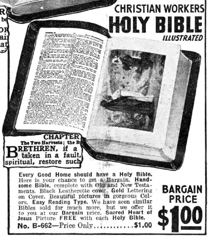
The catalog was one of such a nature as to make an entry for a Bible in it seem incongrouous. Not, though, upon reflection, that those who would order other items in that catalog would not necessarily also desire to own a Bible, and, indeed, believe in the God about which it is written... but because others who also read the Bible would unreservedly condemn nearly everything else in the catalog.
Specifically, this ad came from the Curio Catalog of the King Novelty Co., which also featured such items as...
Lucky Mo-Jo Highest Quality Incense
Aunt Sally's Policy Players Dream Book
High John the Conqueror Perfume
The Success Dream Book
The 6th and 7th Books of Moses or Moses' Magical Spirit-Art
Fortune Telling by Cards
and so on and so forth.
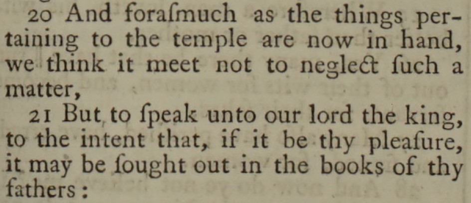
Of course, though, the Bible has been set in many other typefaces, including Times New Roman for recent editions. And thus, in the past, where it was Caslon which was the typeface considered appropriate for nearly all purposes sacred and profane, it was also used for the Bible, as shown below:
And, given that Christians reverently respect the Bible as the Word of God, naturally enough there would also be cases where they would apply the best typography available to it. Thus, here is a sample of the text of the five-volume edition of the Bible from the Doves Press:
