The first page of this section presented an overview of the most notable families of type, to some extent in historical order.
This page will focus on one specific aspect of the history of typography; the transformation of type to be used for body copy, that is, the ordinary text of books and magazines.
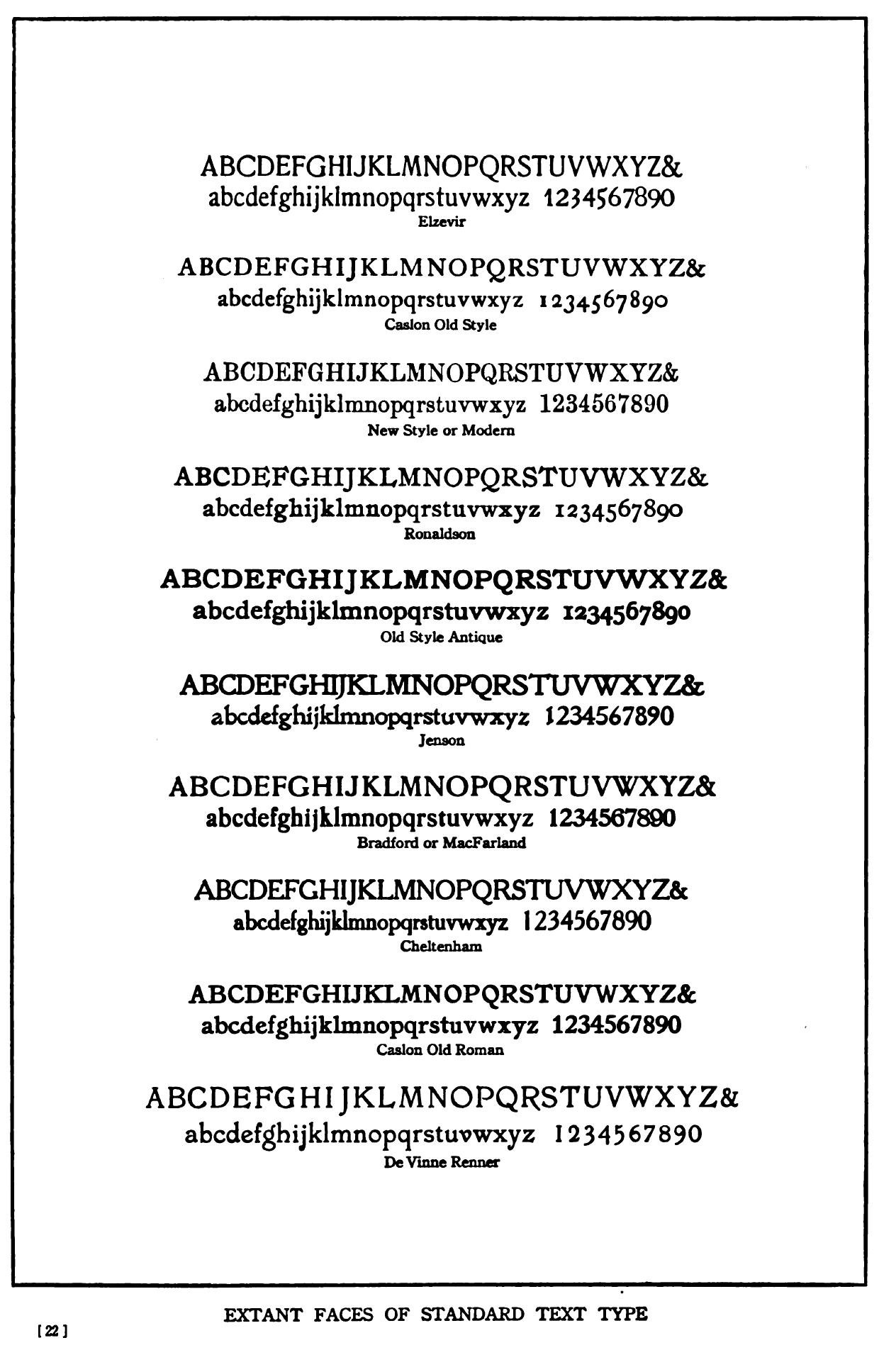
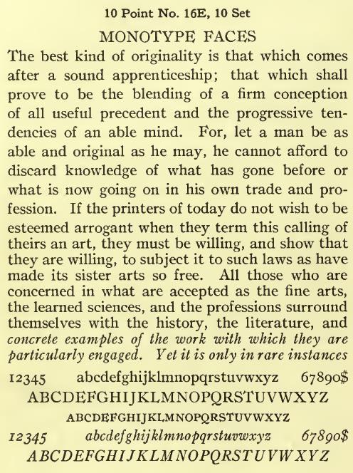
The large illustration below is from an article in the September, 1911 issue of The Printing Art, and shows a fairly representative selection of the usual types for the printing of text used at that time:
The typeface termed "Caslon Old Style" is the one we know today as Caslon, while that termed "Caslon Old Roman" appears to be a variant of Jenson, which is also shown.
The one termed "Old Style Antique" seems to be Cushing Old Style, which we met on the previous page.
Were someone from the present to be transported back to that time, and he had for some reason to have a quantity of text printed, it would be difficult from among the choices available to choose one that is entirely satisfactory to that purpose by today's standards.
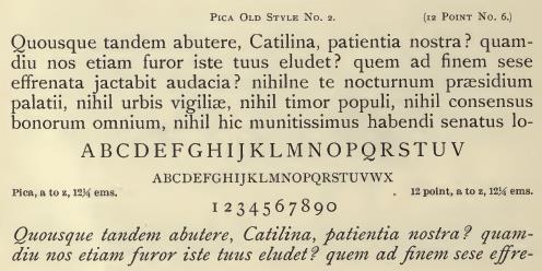
Three of them, "New Style or Modern", "Caslon Old Style", and "Ronaldson" would perhaps be the most tolerable of the available choices. To our eyes today, even these choices look hopelessly dated.
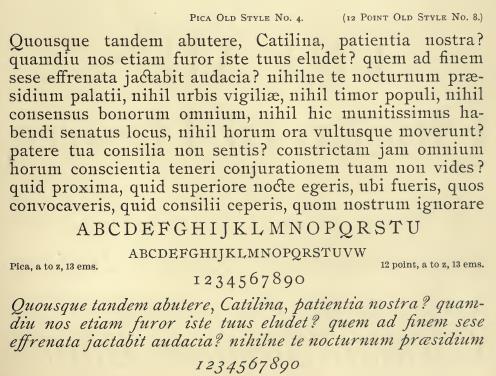
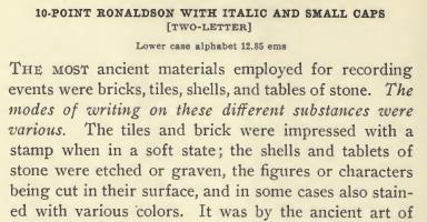
To illustrate that Ronaldson indeed is a reasonably satisfactory choice, here is an example of its use in the Annual Report of the Director of the Mount Wilson Observatory, from 1908:
This sample is from the Convenient Book of Specimens from 1889 of Allison and Smith's Franklin Type Foundry:
And here is Linotype's version of Ronaldson:
And the one from Lanston Monotype:
One can set a date for when that situation had ended completely, at least for users of Monotype machines. It was in October, 1933 that Times Roman became generally available, after being exclusive to The Times of London for a year.
But it had already started to end before that. One thing that might have been asked by someone looking at that diagram listing popular text faces above would be, "Where are Garamond and Baskerville?", but, alas, those types had not remained in continuous use, so they did have to be revived.
American Typefounders (ATF), as noted on the first page, brought out their revived Garamond in 1917, a scant six years after the diagram above appeared:
Monotype was also a major force in reviving worthy typefaces from the past, and they came out with their version of Garamond in 1923.
As for Baskerville, that was also revived by Monotype in 1923, but this time they were the first major firm in the printing industry to revive it; they were prompted to do so by the success of Harvard University Press in 1919 in using type from Baskerville's original matrices at the prompting of Bruce Rogers, who we have encountered previously as the designer of the typeface Centaur.
And, as we are concentrating here on the history of the revivals of worthy older typefaces still in very common use at the present day which led up to the introduction of the novel typeface Times Roman, an event of the year 1931 also bears mentioning. That was when Monotype announced Bembo, their second revival of the type of Aldus Manutilus, the first being the less successful Poliphilus.
This survey of the transition from the typographical scene of the nineteenth century, appearing impoverished to our eyes, to that of the latter half of the twentieth century, is, however, still quite incomplete. Without being exhaustive, only briefly touching on a very few typefaces, this is hardly surprising, but I wish now to address what I feel are the two most glaring omissions in what has been said so far.
In the image which began this page, the typeface labelled as "New Style or Modern" seemed quite usable. And, indeed, among the Scotch Romans of the past, some were quite good, and others were less attractive. But a typeface belonging to that general category that was fully acceptable by modern standards was Century Expanded.
This typeface became available in 1900. It was adapted by Morris Fuller Benton from the original Century typeface, a very condensed typeface made for the Century magazine, designed by his father, Linn Boyd Benton, in 1894.
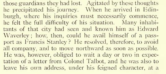
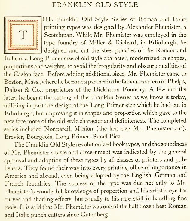
Another older typeface that might be considered one of the most suitable for text was one designed by Alexander Phemister in 1863. Originally known as Franklin Old Style, this design was later used as the inspiration for Century Oldstyle. Here is a sample of it as it appeared in Theodore Low de Vinne's book The Practice of Typography, or, as it is better known, Plain Printing Types.
And here is an example of its use in practice, from the 1896 edition of Lieber's Standard Telegraphic Code:
Here is one from the specimen book of Miller and Richards,
and one from the specimen book of MacKellar, Smiths, and Jordan:
This specimen, again from the Convenient Book of Specimens of the Franklin Type Foundry is of a style there labelled as Bradford, a name we saw in the image that began this page:
but which seems to be similar to the others. And, unlike the style labelled as "Bradford or MacFarland" in that image, the capital D is not depressed at the top.
Here is Old Style No. 1, said to be Linotype's version of the Phemister old style:
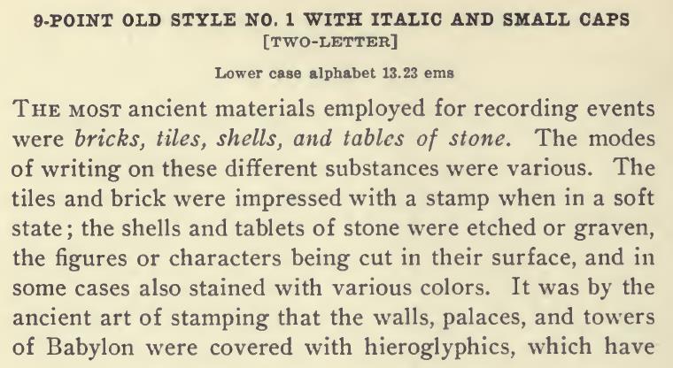
Apparently this typeface, except for the seven capital letters in Ronaldson with flamboyant serifs, C, E, F, G, L, S, and T, is identical to Ronaldson, so simply by changing those capital letters one can switch from one typeface to the other.
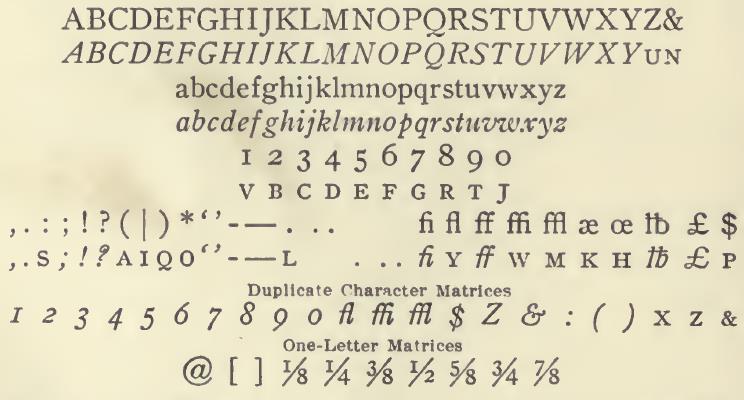
This much is stated in the Encyclopedia of Type Faces; I have not yet been able to locate where it is explicitly stated by Linotype, but the truth of this may be judged by comparing the character set for Ronaldson:
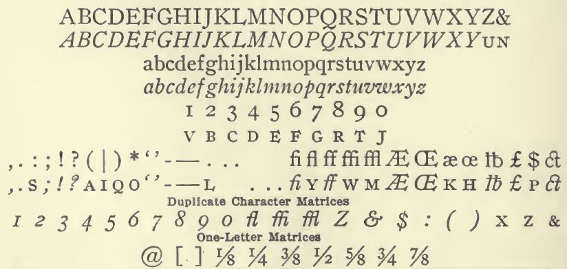
with that for Old Style No. 1:
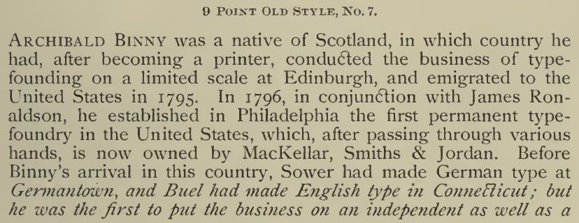
However, in a later Linotype specimen book, it is Linotype's Old Style No. 7 which is noted as being convertible to Ronaldson by changing those letters:
In The Manual of Linotype Typography, it is referred to as Franklin Old Style, and this example gives it praise:
While I am to some extent unsure of whether I've chosen genuinely matching specimens in some of the cases above, this style, billed as Farmer Old Style, from Lanston Monotype is definitely an example of the Phemister old style:
Alexander Phemister, however, is more famous for another one of his typefaces, Bookman. Here it is shown as Bookman Oldstyle, from the ATF specimen book:
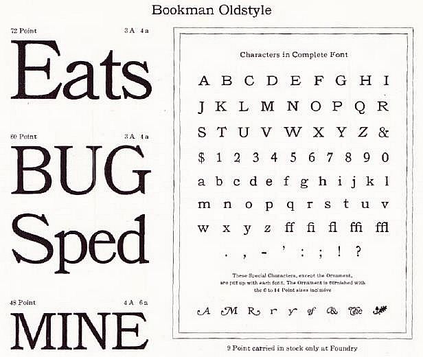
Note that the ATF version of Bookman Oldstyle, at least, did include some swash variants, for the letters A, M, R, and r and y, as well as the ampersand, and logotypes for of and The.
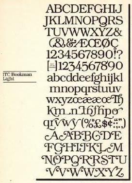
On the right is pictured ITC Bookman™ which was drawn by Ed Benguiat, and which includes a considerably larger selection of swash variants.
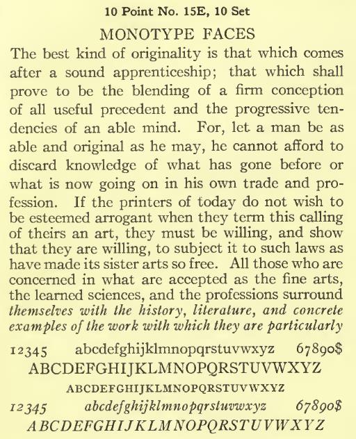
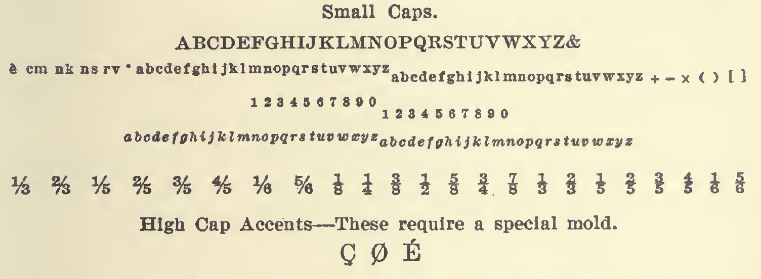
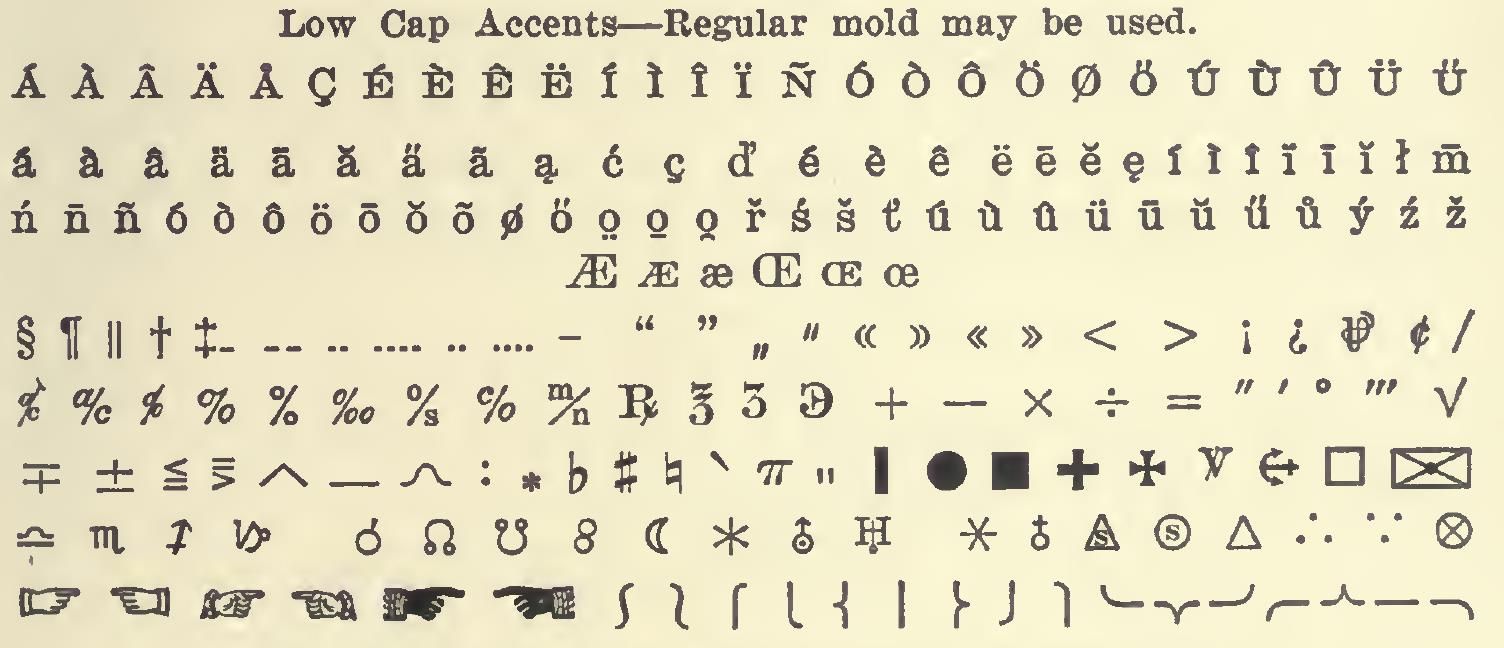
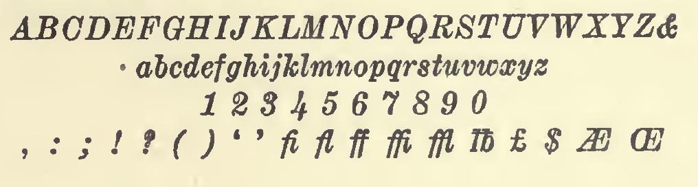
Linotype's Number 21 typeface was a reasonably nice-looking typeface for text. It appeared in Linotype's 1905 specimen book, but admittedly only in the 7 point size.
Here is what it looked like there:
Here are the small capitals, the superscripts, subscripts, fractions, and a few accented capital letters:
And then the rest of the accents, and the special characters:
And finally, the italics:
And here is what the 11 point version looked like, in a clearer image from much later:
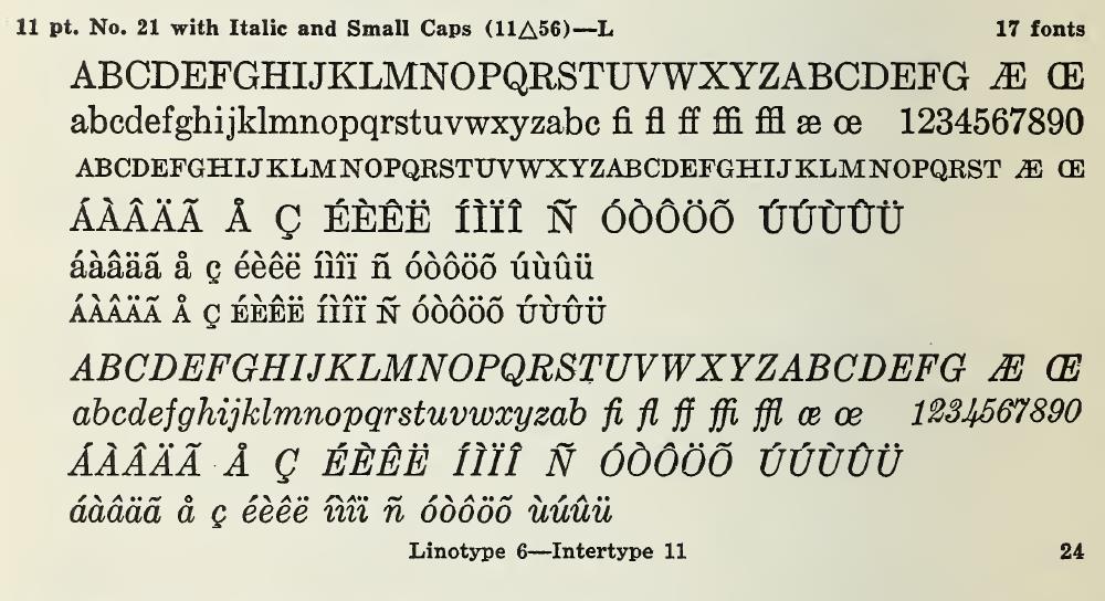
About the only complaint I have about this typeface is that the small capital H is a trifle too wide.