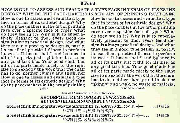
The typeface Times Roman was designed for a very special newspaper, the Times of London. An example of a typeface used in ordinary newspapers would be the Linotype typeface Ionic No. 5, shown below in its 8 point size:

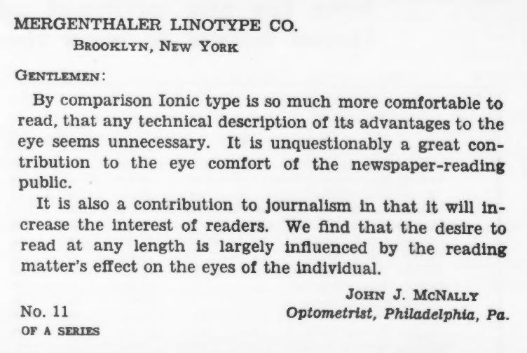
This was the first typeface in Linotype's legibility series, said to have been finished somewhere around 1925. It was first used in the Newark Evening News, and within a year of being adopted by this first newpaper, it became the typeface of 3,000 newspapers!
Here is a clearer specimen on a larger scale:
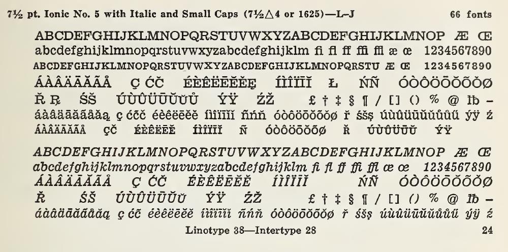
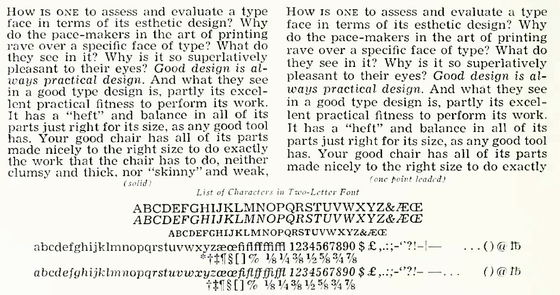
And here is a much clearer illustration of the complete repertoire of characters:
And, yes, there was an Ionic No. 1; here is an image of what it looked like:
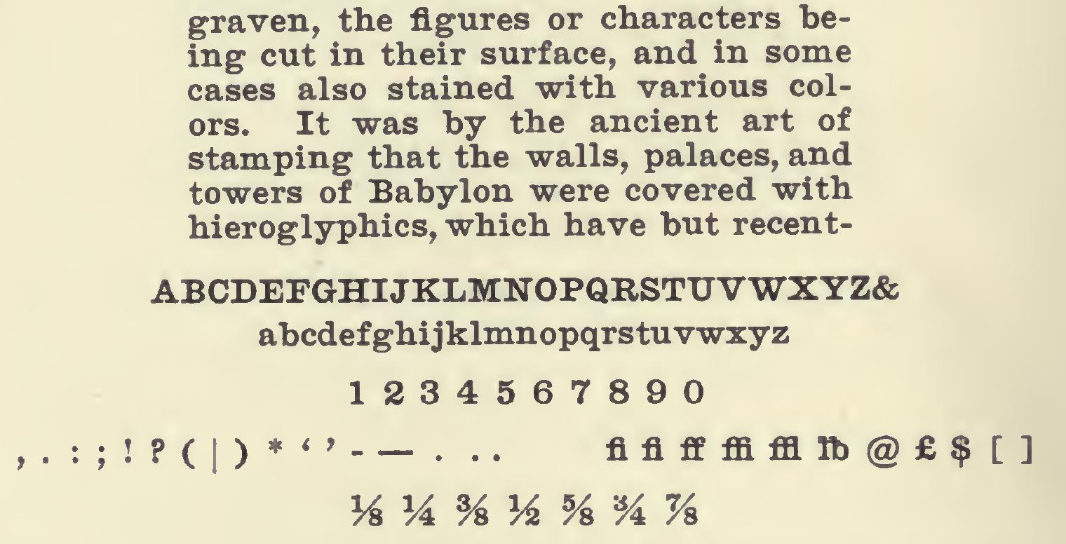
The descenders, although short, were not extremely short, so this was not a newspaper face, just a general-purpose face in a Clarendon style, more closely related to the typefaces shown on the preceding page about Cushing and other highly legible typefaces used for the small print in some Bibles.
Various new typefaces were created to address additional aspects of newspaper printing processes.
The next one to be introduced was Excelsior; because rubber rollers were starting to melt from overheating, newspapers switched to harder ones, which led to ink being trapped in the counters of letters, and so Excelsior was designed so that the open spaces in loops inside the shapes of letters would be larger.
A specimen of the 7 1/2 point size of Excelsior is shown below:
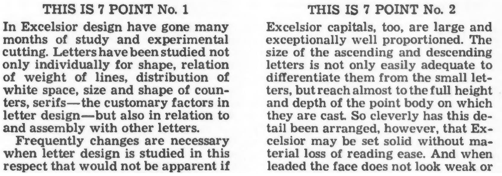
I've found a better-quality specimen of the 7 point size of Excelsior, in two variants, the first size to be cut:
And here are enlarged images of three letters of Excelsior, from the same source:

Then Opticon was created from Excelsior, with slightly thicker serifs and stems, to present an attractive appearance when printed on less absorbent newsprint imported from Europe.
Here is an illustration of the 8 point size of Opticon:
![]()
And here is a clearer specimen of Opticon, this time in the 7 point size:
![]()
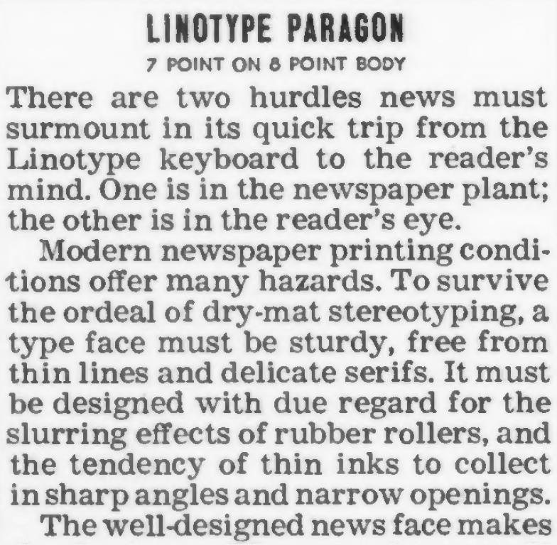
And then came Paragon, with even larger counters, to cope with heavier inking on newspapers with large amounts of halftone photographs on the page.
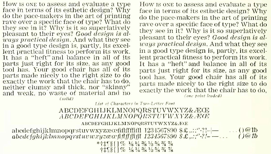
And here is a clearer specimen of Paragon:
A later typeface developed for Linotype's legibility series was Corona, dating from 1941, also shown in its 8 point size, in two versions, one slightly more condensed than the other:

Although this specimen is already fairly clear, here is another one that is even clearer:
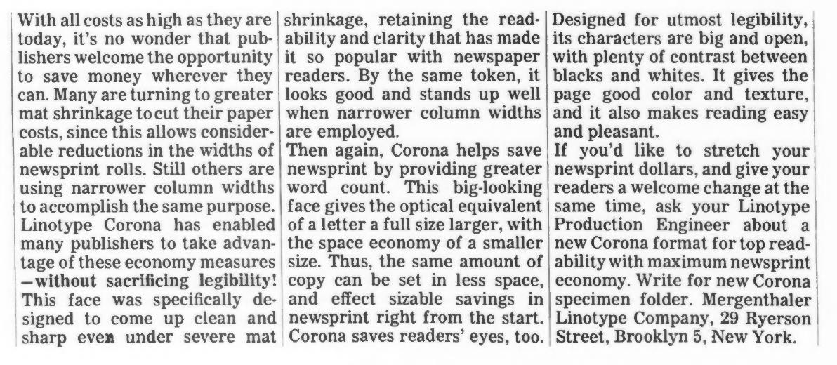
although, like the other clearer specimens above, it suffers from a degree of distortion due to how its source was digitized; as well, here are the letters of the typeface's name, which were presented at a large size:

You may well remember this typeface from your local newspaper, as at least at one time, it was in extremely common use. Of course, nowadays even newspapers are printed by offset lithography, rather than by rotary letterpress from stereotype plates, so a typeface like Corona is no longer eminently suitable to the limitations of the printing process currently in use.
The issue Corona dealt with was the shrinkage of stereotype matrices, which led to the shapes of letters being distorted.
Corona is very similar in general appearance to Century Expanded, having been designed with it as a basis, but it clearly is also very different in some ways, being designed with a very large x-height so as to be easily legible even in a small point size.
Later on, in 1960, Linotype brought out another legibility typeface for newspapers, Aurora, which was very similar to Corona, but heavier in weight.
Along the way, Linotype also produced Textype, which was based on the faces in its Legibility Group, but with not as large an x-height, intended for applications intermediate between fine printing and newspapers.
The text specimen within the illustration below shows an alternate version of Textype with long descenders; this same option was provided for Times Roman. And, as with that face, the version with long descenders is cast on a body one point larger than its stated point size, this being so that the portion of the letter within the x-height will be the same size in both versions of the face, rather than the letters of the version with long descenders being smaller.
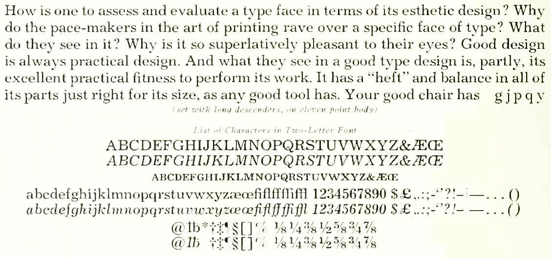
In keeping with its use, this illustration shows the ten point version of the typeface.
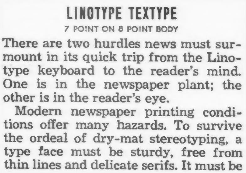
And here is a clearer image of Textype, this time in the 7 point size.
The magazine Modern Mechanix and Inventions was set in Textype starting from its March, 1935 issue.
It continued to be set in Textype when it became Mechanix Illustrated with the June, 1938 issue, and it continued on in that typeface through the 1940s, the 1950s, the 1960s, and the 1970s.
Although there was a change in the magazine's general typographical layout in 1980, which had at first made me think the face in which it was set had changed, I now think that the magazine seems to have continued to be set in Textype at least until 1983. (It continued to be published until 2001.)
Before the Legibility Group of typefaces came along, Linotype already made typefaces with a large x-height and short descenders which were used in newspapers. Their Number 2, or Roman No. 2, typeface was an example of this, shown in this specimen below:
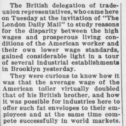
from an advertisement in which it was shown that the new Ionic No. 5 would be as legible as a larger point size of this, and yet give the same word count as a smaller point size of this.
Be that as it may, I think that No. 2 was already a fairly good typeface for this purpose, although, of course, when every penny counts in a large press run, further improvements are worthwhile.
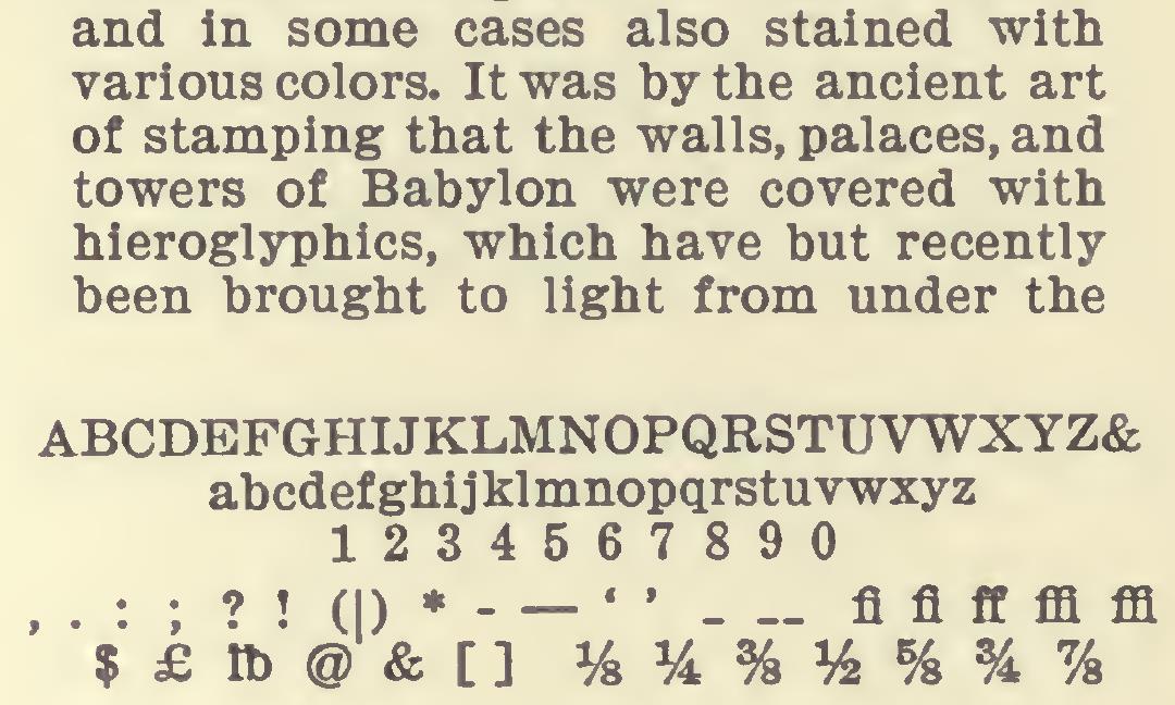
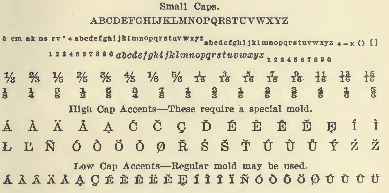
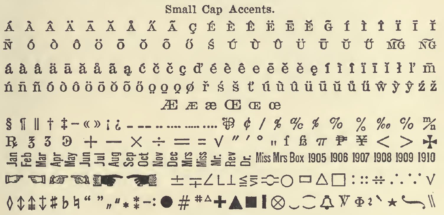
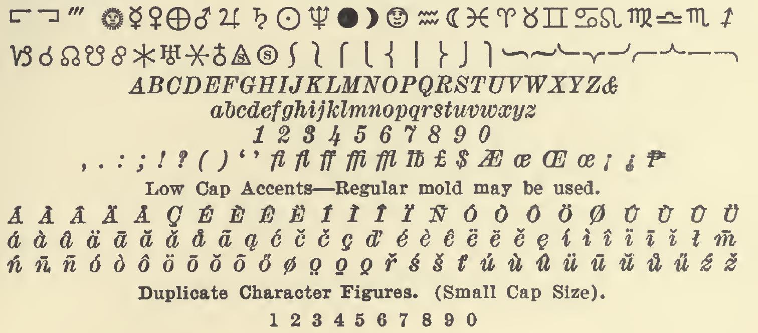
Here, in several images, is the character repertoire offered for Linotype's No. 2 typeface:
First, the basic characters.
Then the small capitals, superscripts, subscripts, fractions, and accented capital letters:
Then, the accented small capitals, and the first few of the special characters:
Finally, the rest of the special characters, and the italics, including their accents:
And here's another image of Number 2, this time from the two-character matrix version, (this is also the 8 point version):
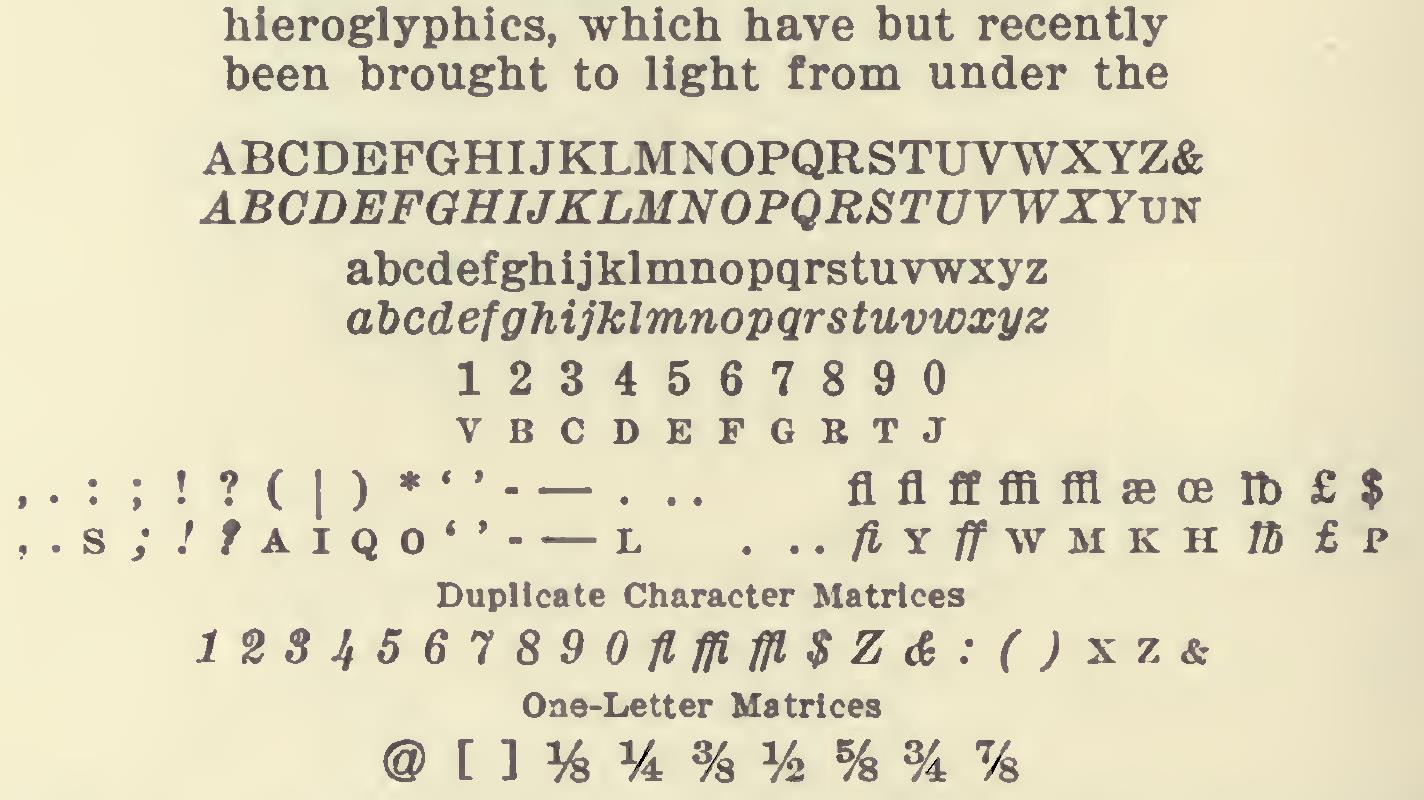
I had to use this as a source for retouching the italic capital F in the previous illustration, so this is the better source at least for that letter. But then, the previous illustration returned the compliment, by serving as a source for retouching the italic capital Z in this illustration.
Intertype, which made machines compatible with the Linotype, also made typefaces suitable for newspaper composition, such as Ideal (1928), Regal (1935), Rex (1939), Imperial (1957) and Royal (1960).
Here is an example of text set in Ideal:

And here is a specimen of Imperial.

And here is an example of text set in Royal.
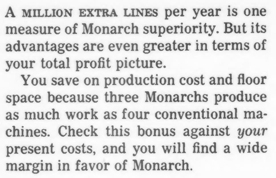
But Intertype wasn't the only other outfit to try to get into the act. Here is Tribune News in seven and a half point size, for the Varityper:
