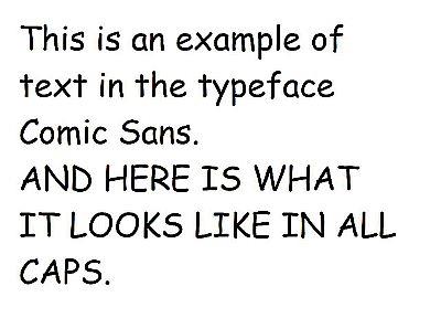
Comic Sans was designed by Vincent Connare for Microsoft in 1994. It looks like this:
It was initially designed to give a casual feel to the applicatiion Microsoft Bob, which was itself much criticized.
But it was a good typeface for that purpose, or for signage associated with nursery schools.
It may not be an ideal typeface for simulating writing on a chalkboard - for which purpose it was used in the announcement of the discovery of the Higgs Boson - but it is not too bad for that purpose.
However it is very different from comic book lettering. An example of actual comic book lettering is shown below:
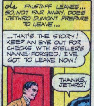
Firms such as Comicraft and Blambot specialize in comic book lettering, and the Canadian firm Canada Type, which supplies digital typefaces of all kinds, includes some comic book typefaces among its repertoire.
Papyrus was designed by Chris Costello in 1982, and the next year, he managed to sell the typeface to Letraset.
It became more popular when Microsoft purchased the rights to include fonts of the typeface with Microsoft Word. One notable early use was in articles in National Geographic magazine.
Here, in a public-domain image from Wikipedia, is what it looks like:
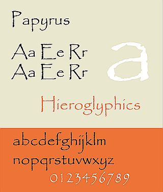
This illustration is based on the Microsft version of Papyrus, which is flawed: by mistake, instead of using the appropriate capital letters of the typeface, the font provided by Microsoft used titling capitals for capital letters, leading to the capital letters not sitting on the same baseline as the lower-case letters, which was not a feature of the original design of the typeface.
Apple also provides a version of Papyrus, and their version is correct.
After this typeface had already become infamous, it was used for titles and subtitles in the movie Avatar, and this ended up being mocked in a famous Saturday Night Live skit starring Ryan Gosling.
Unlike Comic Sans, I happen to like Papyrus, and see its only fault as the fact that it is overused. Aside from its availability in the popular Microsoft Word word-processing program, I feel the reason for its overuse is that it fills one particular role that has become increasingly important of late, and fills it well.
Basically, it replaces typefaces like this:
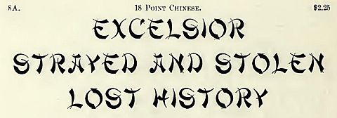
when it is desired to convey the feeling of something "exotic" without giving offence, or suggesting any one particular language or culture.
It may also be noted that Chris Costello can't be all that bad of a designer, as he has been chosen by the U. S. Mint to work for them. While that in itself may not make him the next Augustus Saint-Gaudens, it's still a rather positive testimonial to his talent.
Another, much older, typeface is sometimes much looked-down upon. It belongs to a large category of typefaces with many members; the category of distressed types; that is, a typeface which includes in its design the marks of wear one might see in battered and mistreated type, or type that had been very long in use.
Examples include Roycroft from ATF:
Ben Franklin, from Keystone:
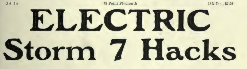
and Plymouth, from Barnhart Brothers and Spindler:
Such typefaces, being clearly intended for a very specialized use, are normally ignored. But another one from Barnhart Brothers and Spindler is the one singled out for disapproval:
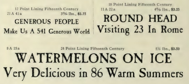
Originally named Fifteenth Century, one of its most successful uses was in the advertising for Cutty Sark whisky.
This typeface initially seemed fated to fade into obscurity. And, thus, in an attempt to boost its sales, which turned out to be highly successful, its name was changed to the one we know it by today: Caslon Antique.
This name is a misnomer; the typeface is clearly based on an older model of type unrelated to Caslon. And perhaps it is only its name that has brought it into disrepute.