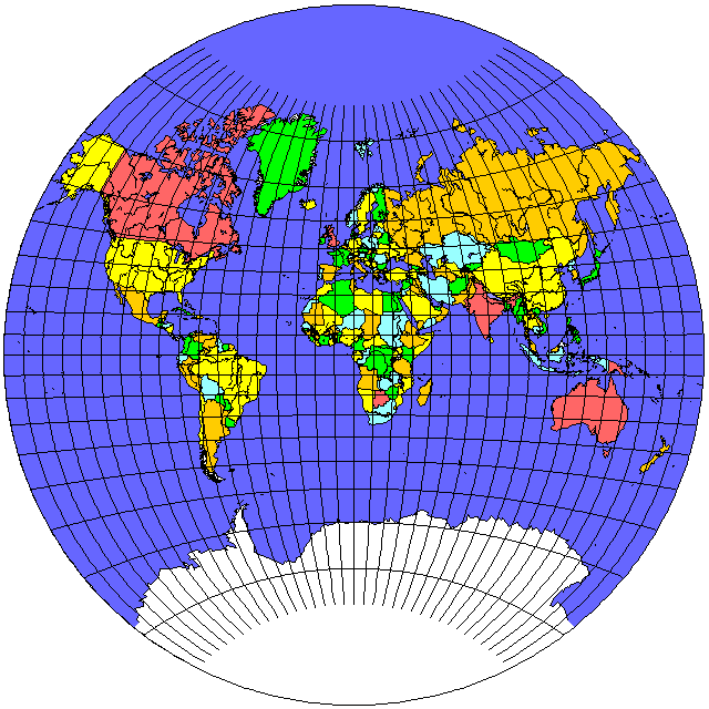
The original Van der Grinten projection was, and continues to be, a very popular projection for world maps:
However, the fact that it distorts areas in a fashion reminiscent of the Mercator projection, if not quite as severly, is understandably perceived as a problem.
The Van der Grinten III projection deals with this by making the parallels straight lines, at the same heights as the parallels intersect the central meridian in the original Van der Grinten projection.
The resulting projection:
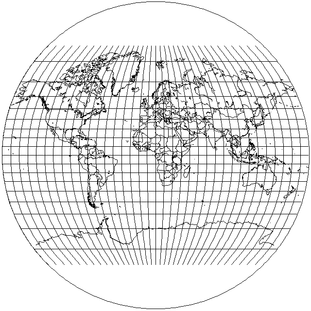
is still not a pseudocylindrical projection, because the meridians are circular arcs, thus being the same as in the original Van der Grinten projection.
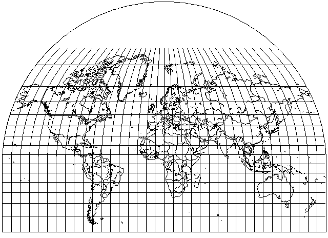
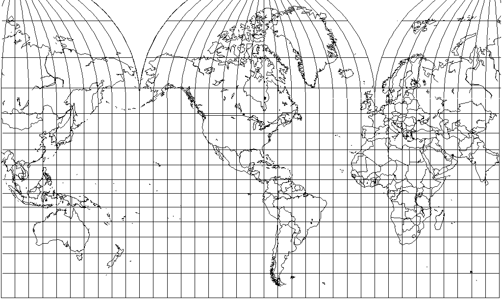
Of course, usually the top and bottom of the projection will be trimmed off:
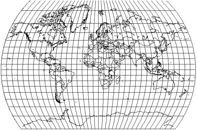
Since the parallels are now horizontal lines, it is even more obvious that the vertical scale at the equator is uniform, and so the Van der Grinten III projection is interruptible. That also means that one could, for example, mate a Van der Grinten III projection of the Northern hemisphere with a Mercator projection of the Southern hemisphere like this:
The significance of this lies in something more than the attractiveness of this particular map. One can transform the map of the world by superimposing a Mercator map on a smaller scale on one of a larger scale, the way the Lagrange Conformal projection was created from the Stereographic projection.
Since the Mercator projection goes to infinity in both the North and South directions, one could also put the equator of the small Mercator map on top of any latitude line on the large Mercator map.
And so here we have a technique for "moderating" the Mercator by replacing its northernmost portion by a series of rounded caps, for a result that would resemble the map prepared for Canada's Department of Trade and Commerce which ended up being reproduced, presumably at a smaller scale, in the atlas which Monarch Flour made available as a premium in 1950, to which I referred to in the page on this site about the Mercator projection.
That map was made more complicated by the fact that the two round caps covered areas of different extent in longitude, one of 170 degrees, and one of 190 degrees. The lines of longitude were at the same height in both caps, so semicircular caps of unequal size were not used.
Of course, there were two obvious ways to deal with that.
One would be to use a semicircular cap covering 190 degrees, and for the other part of the map, trim off the edges, letting it be slightly pointy at the top. The very top of this map was cut off, so there was no way for me to see if that was done.
The other would be to use a semicircular cap covering 170 degrees as the basis. For the 190 degree extent, just stretch that cap out by dividing longitudes by 19/17, and then multiplying the x coordinate by 19/17, the same trick that turned a hemisphere of the Lambert Azimuthal Equal-Area Projection into the Hammer projection, just with a smaller stretch. Here, both caps are round at the top, with neither one being pointy.
However, I've had the opportunity to look again at a photograph of the map in question, and now I see that the situation is more complicated. The map has North and South America in the center; it is interrupted at 90 degrees East longitude.
The central polar cap, which extends from 170 degrees West longitude to the Prime Meridian, has 80 degrees West longitude as its standard meridian, and so it is not symmetrical.
The one on the right of the map apparently has 85 degrees East longitude as its standard meridian, while the one on the left of the map has 100 degrees East longitude as its standard meridian, and so there are three, rather than two, different polar caps involved in the construction of the map, even though two of them have a large area of overlap.
Given this information, the map published in 1938 by Canada's Department of Trade and Commerce could have looked something like this:
However, from the actual picture of that map's reproduction in the Monarch Flour Atlas that I've seen, it appeared to me that the appearance of Greenland was somewhat squashed vertically, compared to what it has in the diagram above, so apparently angular distortion was greater in the scheme they used for polar caps than the one I've devised based on the Van der Grinten III projection.
Another interesting thing about the map was that the Soviet Union was labelled on it as the "Union of Socialist Soviet Republics". I had thought that was a typo when I first saw it, but a web search allowed me to learn that, instead, in those days at least some people thought that when translating that country's name into English from Russian, putting Soviet after Socialist, instead of before, as it was in the original Russian, was appropriate to produce a more idiomatic English translation.