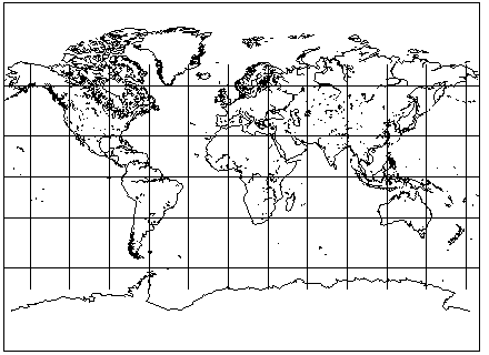
The revival of the Gall Orthographic projection by Arno Peters stirred up a significant amount of controversy in the cartographic community.
Although the Gall Orthographic certainly is not the only equal-area map projection, and some statements by Arno Peters had appeared to make just that claim, that projection still was unique in some ways despite not being attractive to many.
It is (except for versions with small changes to the value of the standard parallel) the only equal area projection that:
So it had something going for it that other equal-area projections did not.
Thus, if cartographers who say "What about the Eckert IV projection?" or "What about the Wagner IV projection?" are not able to convince school boards and the like that there are better alternatives than the Gill Orthographic projection if one wishes to displace the evil influences of the Mercator with an equal area projection, then perhaps the solution is to devise an equal-area projection that people will like.
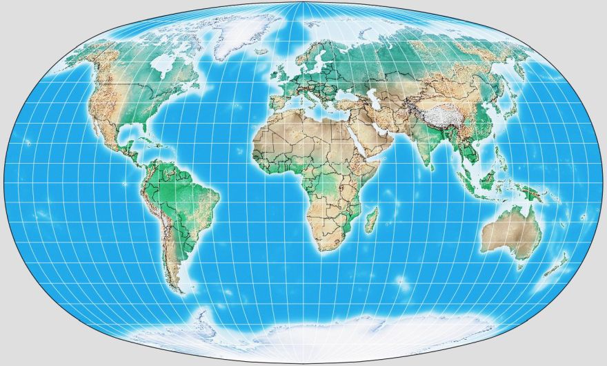
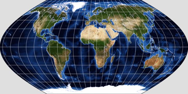
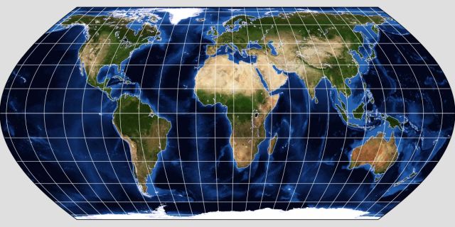
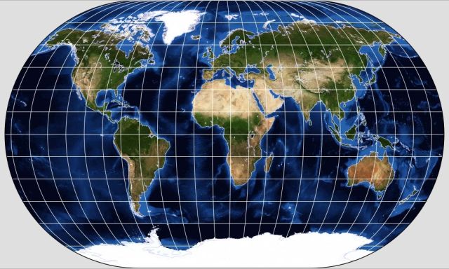
Thus it was that Bojan Šavrič, Tom Patterson, and Bernhard Jenny responded to the revival of the Gall Orthographic as the "Peters Projection" by doing about the last thing that anyone would expect: devising yet another equal-area projection to add to the many which cartographers have at their disposal!
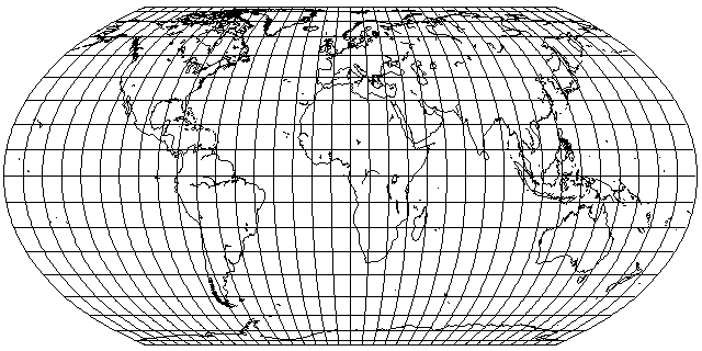
And here is what it looks like:
And just what was this projection intended to have that the others did not?
Well, it was designed to closely resemble the Robinson projection in overall shape.
The Robinson projection is a compromise projection, not equal-area, which was designed empirically to be attractive in appearance, and apparently this design effort was successful.
So, despite not being rectangular and filling a page, at least it has an alternative attribute that just might make it more popular than other equal-area projections.
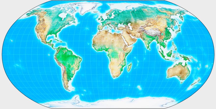
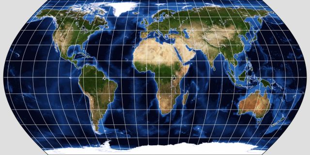
As for the Robinson projection itself, as its parameters were just specified in a table, not given as a mathematical formula, I did not even attempt to implement it in my map drawing program. That, however, did not stop others from fitting a polynomial to those points, and, thus, thanks to G.Projector, here is what it looks like:
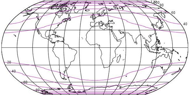
As Flex Projector also has the Robinson projection, here are the isolines of equal shape distortion for that projection:
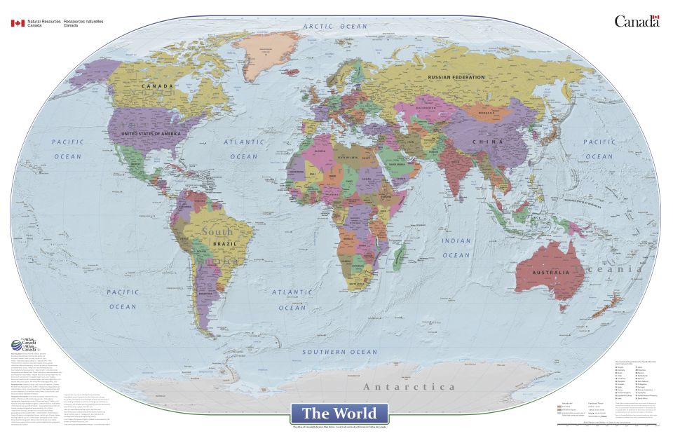
An example of a map drawn in this projection is the political world map from the 2015 edition of the CIA World Factbook, shown below:
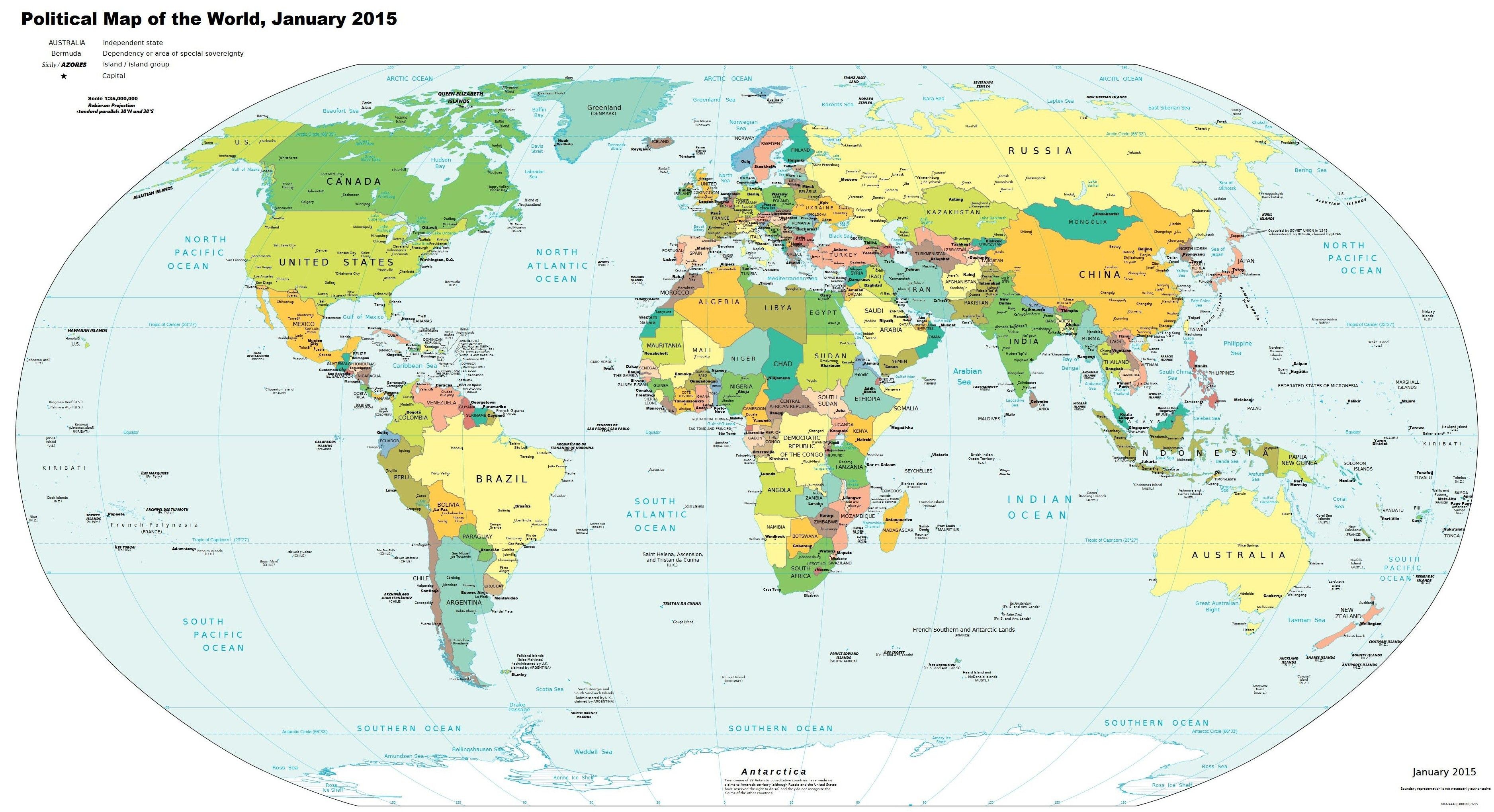
You may click on it to look at a larger copy, sufficiently large to see the names of the countries shown on it. Thus, if you want, say, to know where Denmark is, the information is available here! However, if you're looking for Eswatini, because this map dates from 2015, it is shown under its old name of Swaziland.
I have taken this public-domain map, and I have taken the liberty of altering the larger copy at the link, because the original contained what I consider to be an egregious mistake, one which I cannot account for, since it's not as if the CIA World Factbook is printed in the People's Republic of China in order to save money.
Speaking of finding countries on the map, here is a picture of a coin bank I recently purchased at a thrift shop:
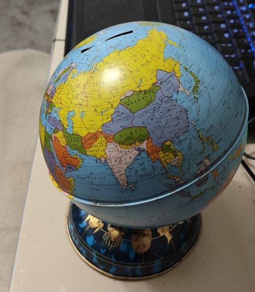
The Soviet Union is shown in yellow, and the People's Republic of China is shown in purple - except for Tibet, which is shown in green.
But what's that little pink area above Mongolia?
Stamp collectors would know, as Tannu Tuva was known for issuing attractive triangular and diamond-shaped stamps of interest to stamp collectors during its existence, which spanned the years from 1922 to 1944. Before the revolution in China led by Dr. Sun-Yat Sen in 1911, Tannu Tuva and Mongolia (then called Outer Mongolia, in contrast to Inner Mongolia, which remained a part of China) were parts of China. But in the chaos of that revolution, Imperial Russia was able to grab Tannu Tuva, Outer Mongolia, and Sinkiang province off of China.
While the Soviet Union kept Tannu Tuva and Mongolia under its control, it gave back most of Sinkiang to China fairly early on, only temporarily holding on to a small western portion in which they were able to set up a regime friendly to the Soviet Union.
I went looking for a map showing Tannu Tuva more clearly and accurately that I could use without copyright concerns. It took me a while, but I finally found one:
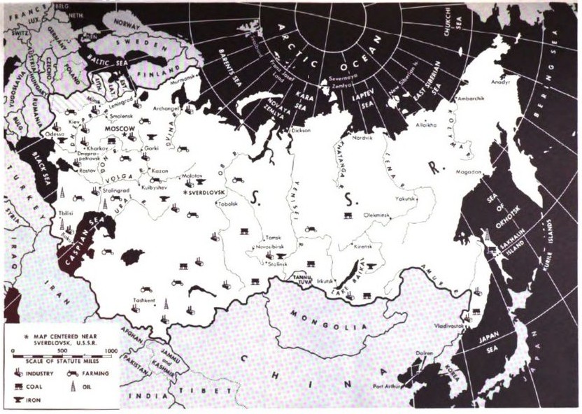
This map appeared in Armed Forces Talk, a U. S. Government publication, on the back cover of issue 475, for September 1st, 1954.
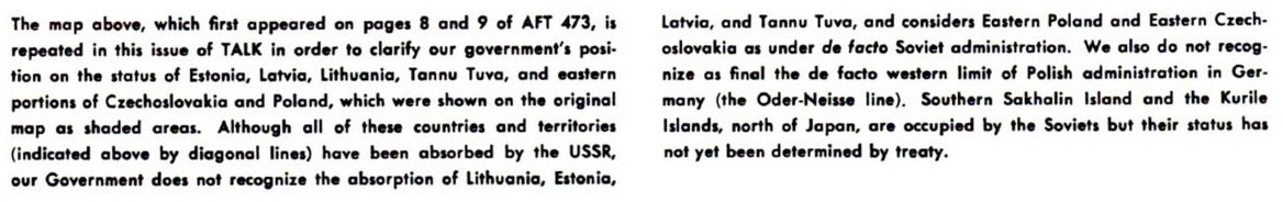
The caption of that map noted that the United States did not recognize the annexation by the Soviet Union of the Baltic nations, Estonia, Latvia, and Lithuania... or its annexation of Tannu Tuva. That caption is reproduced below as well:
So the mystery of why Tannu Tuva appeared on Ohio Art globes is now solved. It wasn't that the company was unaccountably cheap or lazy in failing to update their products... instead, since these durable and inexpensive metal globes were intended for the use of young children, they were just being patriotic!
And note that while Sinkiang province isn't outlined within China, Tibet is named and outlined; so it may well be, given the intense controversy associated with the annexation of Tibet by the People's Republic of China, that the United States didn't recognize that either! However, up until Nixon, the United States considered mainland China to be part of Taiwan as far as diplomatic recognition was concerned, so the story must be more complicated, if not more nuanced.
And if you look over to the East, while the border between the Democratic People's Republic of Korea and the Republic of Korea is shown, the name "Korea" straddles that border, indicating that some sort of "One Korea" policy was also in effect at the time.
Also, if you look South from the Eastern side of Lithuania, you will note that the shading of the Baltic countries continues: also not recognized, apparently, were the postwar changes to the boundaries of Poland and Germany, although this wasn't mentioned in the caption.
While not equal-area, the Robinson projection certainly does exaggerate areas in the northern areas of the map to a much lesser extent than does the Van der Grinten I projection,
thus making the choice on the part of the National Geographic Society to switch from that to this projection for their regular world maps one in step with the times. (Of course, my personal response to the Robinson projection is along the lines of "What, isn't the Winkel Tripel good enough for you?", but apparently studies have indicated that people prefer projections with straight parallels to those with curved parallels. But then, vertical meridians are also preferred, according to those same studies, which perhaps means that we can't do better than the Miller Cylindrical.)
Which is illustrated above as well.
Speaking of the Winkel Tripel, after the National Geographic changed from using the Van der Grinten for their world maps to the Robinson projection in 1988, they later changed to the Winkel Tripel in 1998 (looking at a picture of one of their maps, apparently they went for the original Winkel Tripel rather than the version with Bartholomew's scaling: I was able to tell fairly easy because in the original version, Africa is noticeably stretched vertically by a greater amount). As they started using the Van der Grinten in 1922, the Robinson did have a shorter lifespan.
As it happens, the authors of the paper describing the Equal Earth projection had previously authored a paper, A compromise aspect-adaptive cylindrical projection for world maps, in which they proposed a modification of the Miller Cylindrical projection, the Compact Miller projection! As the name implies, it is compressed vertically compared to the original Miller Cylindrical projection, specifically by having the vertical scale cease to increase significantly after 55 degrees latitude.
Later, they came up with a further modification of that, the Patterson Cylindrical Projection, in which the vertical scale then starts to decrease.
While I wish the creators of the Equal Earth projection every success in the endeavor of challenging the revival of the Gall Orthographic, the choice of creating a new projection specifically as a response to it, particularly one based on æsthetics (when it seems, at least to me, like that is a criterion that would surely be satisfied from among the wide variety of existing equal-area projections) is still a turn of events that makes me want to scream.
Of course, giving it the name "The Equal Earth Projection" is also part of the strategy; to hype it up as being a projection that shows everything equally.
But because it is a pseudocylindrical projection, it favors the standard meridian, which is likely to be chosen in favor of wealthy and powerful countries, and so the argument that the Gall Orthographic projection is more equal can still be made.
Of course, that base has also been covered, through the advocacy of the Hobo-Dyer projection as an alternative.
But the Hobo-Dyer projection is still stretched enough to be unattractive to me, at any rate, and its standard parallel of 37.5 degrees still favors the developed world to some extent.
So another alternative that might be tried could be the Behrmann projection. It has a standard parallel of 30 degrees. Northerly regions are still stretched unattractively, even more so than before, but tropical regions no longer also stretched to such an extent as to be unattractive, and Europe and the United States, while definitely stretched, are still not stretched by too excessive an amount.
One could modify the Behrmann projection by only curving the meridians slightly, say to make it resemble the Modified Gall projection of Brigadier Guy Bomford, using the same mathematical technique involving a polynomial and its derivative that was used to design the Equal Earth projection, but for the moment at least I will resist the temptation.
Of course, another way to look for the "best" equal-area projection would simply be to look for the one with the lowest distortion. J. P. Snyder attempted to do that using the aid of a computer, and obtained this projection:
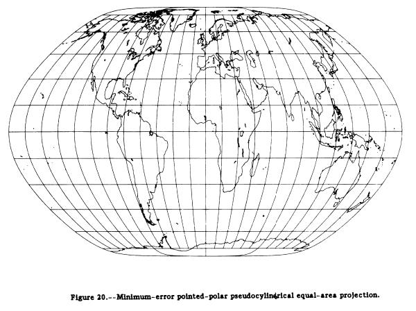
from the portion of Computer-Assisted Map Projection Research, U. S. Geological Survey Bulletin 1629 that discusses minimum-error map projections.
The poles are points, in order to avoid infinite error at the poles causing trouble for the program, but note that the program chose a shape closely resembling one with pole-lines.
The projection has considerable stretching of the equatorial areas.
I, personally, find it less than attractive in overall appearance, but it illustrates why many modern projections have certain characteristics - they are helpful in reducing angular distortion. Thus, the sides are almost straight with a sudden equatorial bend so as to allow the maximum width at the equator to moderate the vertical stretching - and the vertical stretching produces less angular error than shear.
It turns out that the Robinson Projection is not the only example of a projection where no scheme of construction was given, but instead the height and width of each parallel was just specified directly.
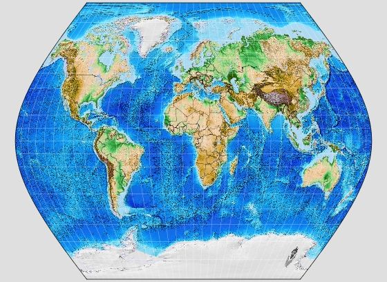
Again thanks to G.Projector, as once again I have no plans to attempt to implement this projection myself, is the Baranyi IV projection, from Hungary.
Unfortunately, Flex Projector, while it includes the Robinson projection, omits the Baranyi IV, so I can't show you what the average of these two projections would look like; no doubt it would be highly aesthetic.
The shape of the Baranyi IV, with four curved sides and four more strongly curved corners, is reminiscent of the shape of the face of the CRT in a television set. It would not surprise me if this projection were consciously designed to be "futuristic" in appearance.
Another example of a pseudocylindrical projection designed primarily to be attractive in appearance is the Ginzburg VIII projection:
This projection has clearly been designed to be less radically different from the Mercator that many people are used to, compared to the others we've seen here.
In fact, although most of the pseudocylindrical projections with which I had been familiar had been equal-area, I've recently discovered that quite a few attepts at making an attractive compromise projection for the world map involved creating a pseudocylindrical projection.
The web search that led to this was prompted by finding this blog page showing a map from a North Korean encyclopedia which included an atlas. You'll need to scroll down quite a bit to find the world map which was of interest to me; there's also a map of the Pacific Ocean there which seems to be on the same projection.
Here, as my first example of a projection in this category, is the Wagner II projection:
Like many others of those which will follow, this image was made with G.Projector, which I've mentioned before.
A variant of the Wagner II projection was devised by Canters, the Canters W02:
And here's a projection used in one edition of the Times Atlas of the World, which has become known as the Times Atlas projection:
Yet another example of a projection in this category is the Kavraisky VII projection:
And another is the Urmaev Sinusoidal projection:
Some time previously, I encountered this attractive map, which was a product of the Canadian government, online:
The image above is © Copyright 2021, Her Majesty the Queen in Right of Canada, as represented by the Minister of Natural Resources, and is presented on this web page under the terms of the Open Government License - Canada 2.0.
You can visit this page yourself to download a full-size copy of this map.
At the time I first encountered this map, although even then I thought it looked nice, I didn't consider mentioning it here, as I wouldn't have had much to say about it. But when I encountered it again in the web search prompted by learning about the pseudocylindrical projection used in a map from North Korea, I found the link given above for downloading it, and once I could view the map myself in a larger size, I found that it was on the Winkel II projection.
The equal-area Eckert IV projection is discussed on an earlier page in this section. Related to it is the simpler Eckert III projection, drawn within the same outline, but with equally-spaced parallels, instead of being an equal-area projection:
Using equally-spaced parallels within an ellipse twice as wide as it is high produces what is referred to as the Apian II projection:
The Winkel II projection, which G.Projector is also capable of drawing:
is the arithmetic mean of the Apian II projection and an equirectangular projection with a standard parallel of the arccosine of two over pi, approximately 50.459776 degrees, the same as used to construct the original Winkel Tripel projection.
It is possible to make equal-area projections that don't distort the shape of the land too much, for example by the use of interrupted projections, and it is important for many reasons to have maps which correctly depict the areas of countries and regions.
One of the chief uses of the Mercator is for wall maps, however. A wall map is usually sufficiently well detailed that if you stand far enough away from the map so that you can see the whole map, most of the printing on it will be too small for you to read.
From this fact, one can conclude that the Mercator is just perfect as it is, and doesn't need any improvement: when you stand up close to it, to just look at, say, France or Switzerland, you will automatically get a reasonable-looking map of France or Switzerland, without the map having to electronically detect how close you're standing and re-draw itself... which is possible, although still somewhat more expensive, with today's technology, but back when maps were made with ink on paper, it was clearly not an option.
On my page about the Lambert Conic Conformal, of course, I note that it is possible to make conformal maps that exaggerate scale rather less than the Mercator. However, if one is just looking at a small part of the map, the exaggeration of scale becomes essentially irrelevant - except for providing a more detailed map of areas more likely to be of interest (all those small countries in Europe) - and then the Mercator map still has the other advantage that North is always up!
And, of course, incidentally the argument made in these last few paragraphs doesn't just give additional reasons why the Mercator projection could be a valid choice for the classroom... it also explains why it was just about the only possible choice for Google Maps!
But I can understand that people will still feel that putting a tiny map of the world in the Goode Homolosine projection or the Eckert IV projection in the corner of a Mercator map, although that does provide people with the information about what the relative areas of the world's places actually are, is not enough to dispel its unconscious influence.
Perhaps this debate touches on another aspect of the liberal versus conservative dichotomy besides liberals, rather than conservatives, considering Eurocentricism a matter of urgent concern. Many liberals see human beings primarily as feeling beings, which is a good thing, because it means we feel compassion for others in our normal condition. Many conservatives, on the other hand, see human beings, at least in the first approximation, as rational beings.
And from that viewpoint: don't classrooms have globes in them? As long as we're not talking about people who have never seen a globe in their lifetime, of course they know perfectly well that Greenland isn't that big, and so, as the Mercator map is the best tool for its particular purpose, there's absolutely no reason to stop using it. Subconscious influences? Rubbish!
And so if a school can manage to afford one globe, or at least its Mercator map has an equal-area map on it as an inset, but it can't afford an atlas for each student, so they have to walk up to the wall map and look at it, the Mercator map is the only one that can do the job: one map that also functions as a complete atlas of the world. (Incidentally, that's also why the Mercator projection was the ideal choice for Google Maps!) Of course, one would have to go back to the nineteenth century, or further, to find a time when schools in the industrialized world were on quite such tight budgets. Today, it probably isn't that often that students would walk up to the map on the wall for a closer look, so the correct overall impression is more important compared to the ideal local behavior of the Mercator than it had been. But that highlights perhaps the most important point: before running out and getting a new map based on a different projection, to know that you're getting the right one, you need to be firmly aware of what the map will be used for.